Throughout April, we've been hearing a continual chorus of rumors from separate sources all saying the same thing: Google has some major design changes coming across all its products. While consistency and staying power don't really make a rumor true, when Googlers hint that the company is moving along mostly the same line and app updates begin to match the rumored design style, we start to take notice.
The most far-reaching of these rumors comes from 9to5Google, which at the beginning of the month posted about an internal project called "Google 2." The project would redesign many apps with a focus on "full page display of content, and moving menus and other distractions out of the way." The redesign would reportedly affect Google apps across Android, iOS, and the Web, with the goal of having a single design able to scale from wearables to desktops.
Some readers are probably having traumatic flashbacks to 27-inch metro apps on Windows 8 right about now, but Google has come up with ways to scale apps across screens that don't result in terrible desktop apps. Consider something like the Android Fragments API, which is what allows the same app to power phones and tablets. In Gmail on a phone, only the inbox view is shown, but on a tablet, the app switches to a dual-pane mode with the inbox and navigation panel placed next to each other. Google has also been playing with selectable information density on the desktop, which you can change in Gmail just by clicking on the settings gear or by resizing the window.
There is also a huge difference between "a single design" and "a single app," which is where many of the problems with Windows 8 apps come in. Google would still presumably have a mix of apps written in different languages for different platforms. The apps would just use all the same style of icons, buttons, and layout—right now, Gmail on each platform looks wildly different.
Corroborating evidence
If you're like us, you look at reports like this and ask, "Why should I believe this?" Until now, there wasn't much in the way of additional information. A few days ago, though, the head of Android's User Experience, Matias Duarte, gave an interview at the Accel Design Conference and spoke about the future of design at Google. In the interview, Duarte said that designing specifically for mobile devices is a thing of the past. "We need to stop thinking of 'mobile' as a distinct category," he said, and after mentioning desktop, mobile, in-car, and wearable devices, he stated that "all of these should be considered as one design problem—as one product."
This interview came out two weeks after the 9to5Google rumor, but the two seem to match up perfectly. Google may actually start treating every screen the same way and work to unify its product design across platforms.
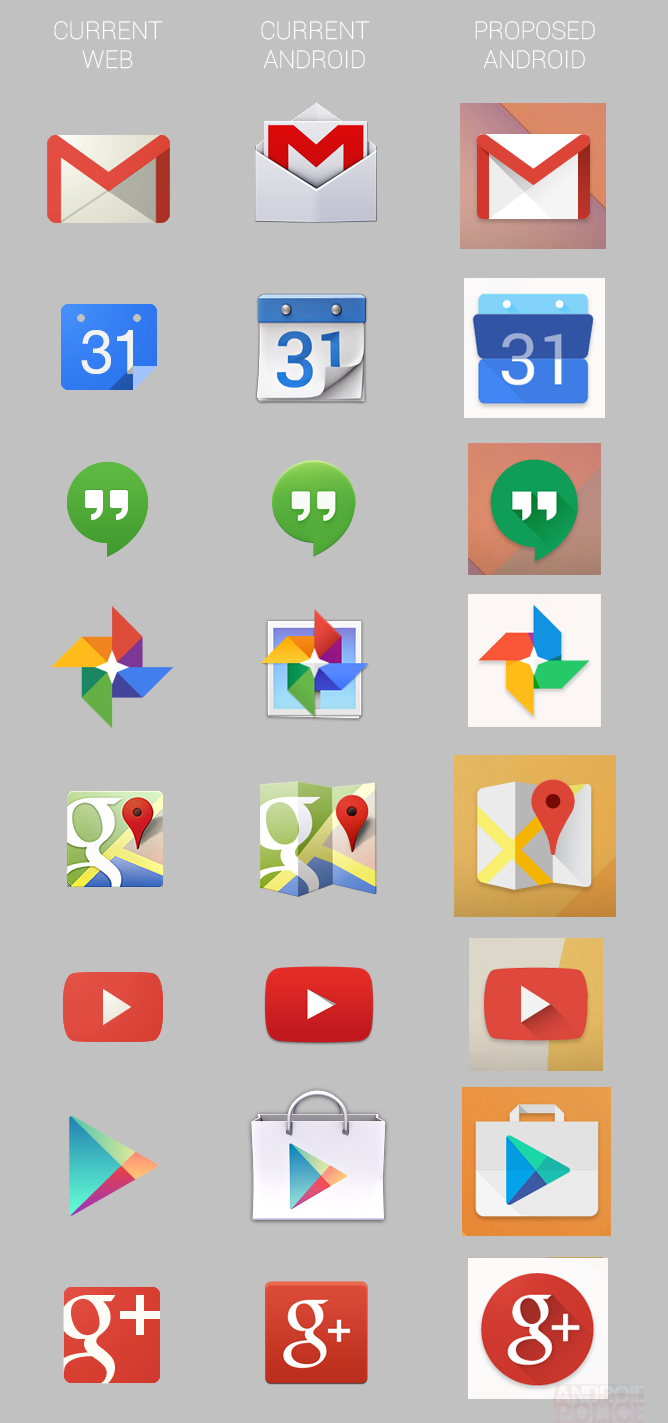
Google currently has two completely different sets of icons, one for the Web and one for Android. Both styles are well thought-out, and Google even maintains two completely different style guides (Web/Android) for the two platforms. They certainly aren't cohesive, though, and according to the leak, Google is going to remedy that.
You can see some of the new icons on the right in the third column (there are more in the initial report). For the most part, Android's existing icons are being scrapped, and evolved versions of the Web icons are taking over. The look is a big departure from Android's current icons, and it cleans up some of the oddities that Android introduced, like Gmail's envelope-inside-another-envelope design. Google just has to have silly code names for everything, and according to the report, these designs are internally referred to as "Moonshine."
Why should we believe this rumor? Well, aside from perfectly lining up with Google's plan to unify products across devices, a few of these never-before-seen icons were actually spotted on a live Google page after the report went up. That's still the Web and not Android, but it proves that the source had these before the general public knew about them. New icons aren't the only thing it will take to unify Google's various products, but they represent a good step toward a more cohesive experience.
The next step is to redesign the products themselves. A typical Google product will have different, competing designs on Android, iOS, Glass, Android Wear, and the Web, so it's hard to tell what an end result would look like. We've been hearing a lot of rumors about a new, more colorful design style for Android apps, and while these designs are probably not the final iteration of a unified look, they are a step forward from what is on Android now.
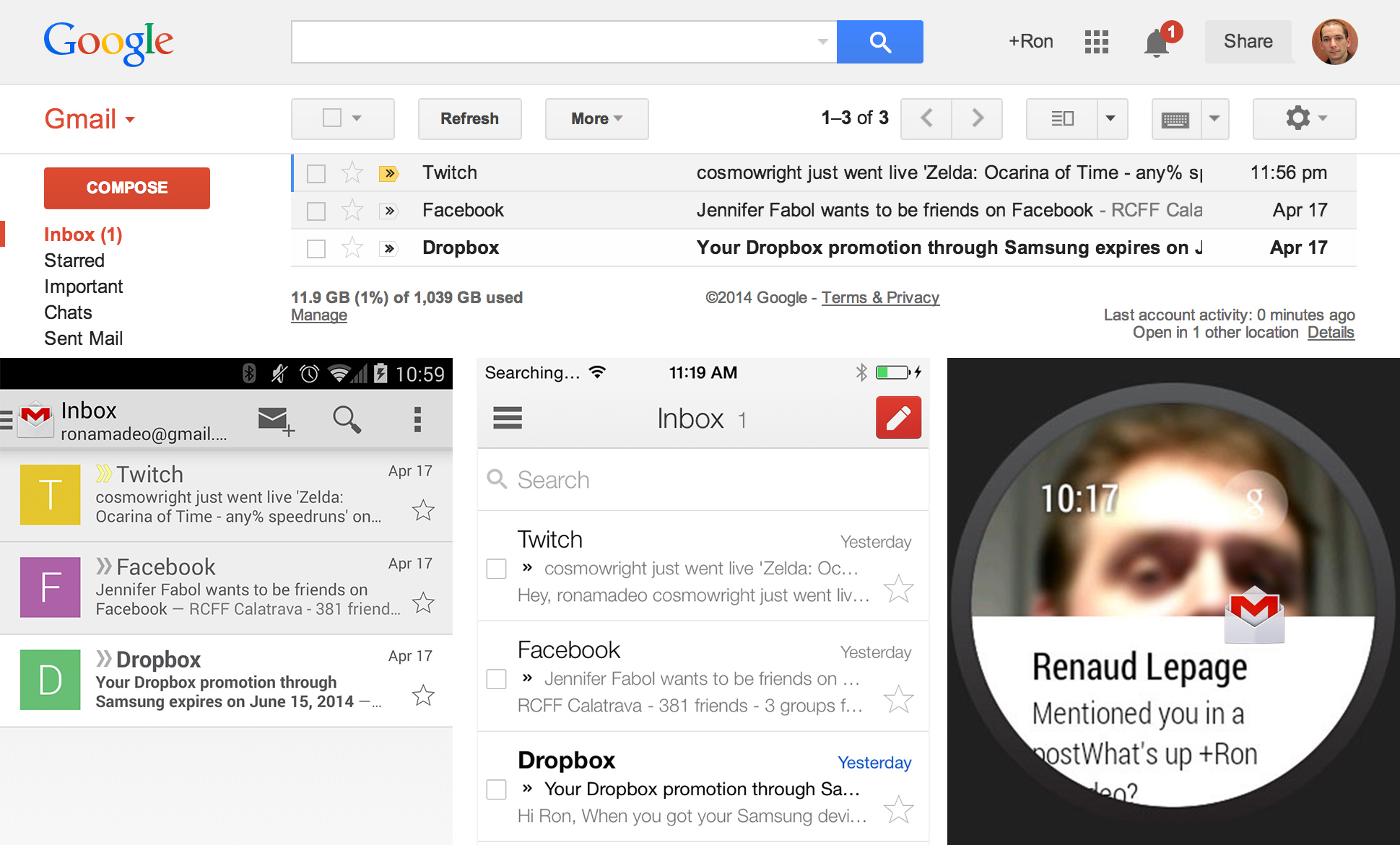
The first leak was a wild set of screenshots from Geek.com. The report showed a very unfamiliar Gmail design and said the app would be getting the ability to pin and snooze e-mails. The report claims the screenshots are from Android, and while the top and bottom bars are from Android (an HTC One M8), the app looks like the iPhone version of Gmail to our eyes—scroll up and compare it against the iPhone and Android versions.
We would speculate that this in-progress design is way too far off from the current Android Gmail design to ever be a reality, but the major design elements are what's important. There's a colored action bar like the Google Play apps, a navigation drawer with colored icons, and a mysterious floating red action button (new mail?) in the bottom-right corner. There are also unifying elements with the Web version, like switching to the same trash and spam icons.
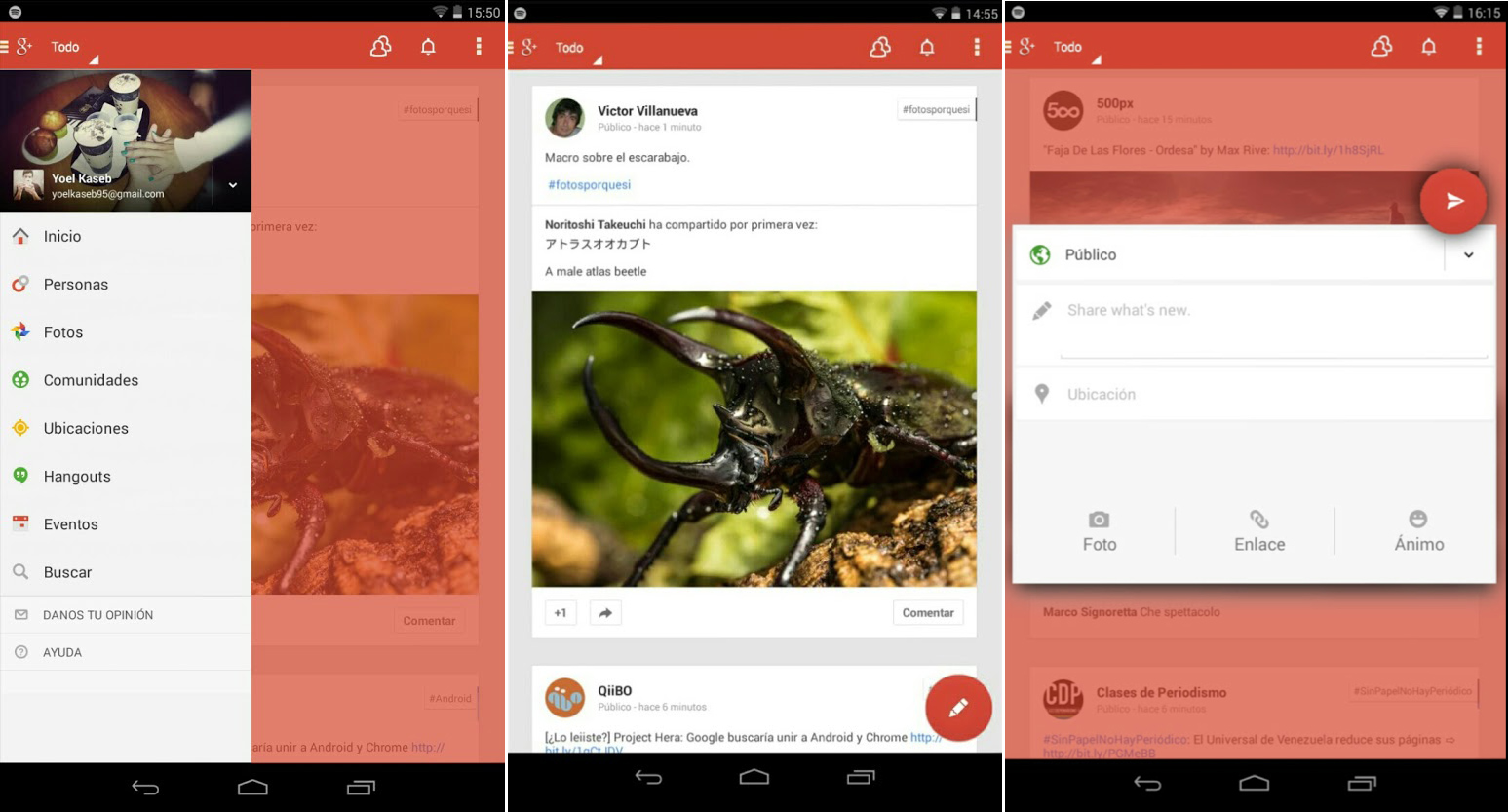
We later saw an evolution of this design style from Yoel Kaseb on Google+. This version was another colorful design, but it seemed a lot closer to something that would look at home on an Android device. The action bar looks more like a native app, with the navigation drawer button in the right spot and an overflow button. Like the Gmail leak, we see a colored action bar and a big red action button. Google+ takes things a step further and adds a red background overlay anytime a pop-up is open. Google+ on Android is pretty close to the desktop version right now, so not too many changes are needed to bring the two in line with each other.
While these two work-in-progress designs are interesting, they're definitely not the final embodiment of Google's cross-platform design unification plan. Our best bet for more news on the subject is to wait for Google I/O 2014, which is just 64 days away. Coincidentally, the company has announced that design will be a big focus this year.
reader comments
42