
In the beginning, the device-specific media queries we’ve been using in our websites served us just fine because we just needed a quick-and-dirty responsive design solution to accomodate the iPhone and similar-sized smartphones. But with the constantly expanding amount of devices being put out in the market, it’s time to rethink the common responsive design breakpoints we’re employing in our designs. Why?
Because this approach isn’t sustainable. We also have to change the underlying reasons and motivating factors behind why we’re setting our responsive design breakpoints at these particular points. I’ll discuss the idea of design-based media queries (as opposed to the more prevalent way of basing our media queries on common mobile devices).
This approach to responsive web design could help us make our sites as future-proof and device-agnostic as possible.
Why Our Media Queries Need to Change
The media queries we are using are typically based on the screen dimensions of currently popular mobile devices. At first, when the web design community started getting serious about responsive web design, the popular mobile devices were the iPhone and Android smartphones.
So, to start, media queries for mobile devices looked something conceptually similar to this:
/* iPhone and other smartphones (portrait) */ @media screen and (max-device-width: 320px) { } /* iPhone and other smartphones (landscape) */ @media screen and (max-device-width: 480px) { } As technology moved forward — and in particular with the rise of tablets and retina displays — the range of screen sizes and resolutions broadened. So we decided to extend our media queries for these new mobile devices. To accommodate the new crop of gadgets, media queries would now look something similar to this:
/* iPhone and other smartphones (portrait) */ @media screen and (max-device-width: 320px) { } /* iPhone and other smartphones (landscape) */ @media screen and (max-device-width: 480px) { } /* iPad and other tablets (portrait) */ @media screen and (max-device-width: 768px) { } /* iPad and other tablets (landscape) */ @media screen and (max-device-width: 1024px) { } /* iPhone 5 (portrait) */ @media screen and (max-device-width: 568px) and (orientation: portrait) { } /* iPhone 5 (landscape) */ @media screen and (max-device-width: 568px) and (orientation: landscape) { } Samsung Galaxy is really popular too, so we might as well add it to our growing collection of media queries:
/* Samsung Galaxy (portrait) */ @media screen and (max-width: 385px) { } /* Samsung Galaxy (landscape) */ @media screen and (max-width: 690px) { } /* iPhone and other smartphones (portrait) */ @media screen and (max-device-width: 320px) { } /* iPhone and other smartphones (landscape) */ @media screen and (max-device-width: 480px) { } /* iPad and other tablets (portrait) */ @media screen and (max-device-width: 768px) { } /* iPad and other tablets (landscape) */ @media screen and (max-device-width: 1024px) { } /* iPhone 5 (portrait) */ @media screen and (max-device-width: 568px) and (orientation: portrait) { } /* iPhone 5 (landscape) */ @media screen and (max-device-width: 568px) and (orientation: landscape) { } What about Kindle?
Or the iPad mini? Not to worry, there’s a list of media queries for Kindle (and other devices) and there’s a list of Apple-product-specific media queries for the iPad mini, iPhone 2G, etc. to help us extend our media queries collection.
The reason for showing you all of this is to illustrate how this approach to responsive web design does not work. This way of designing websites contradicts one of the key principles of web design that we need to always work towards: There should be no strong distinction between Desktop Web and Mobile Web. And, ideally, there should only be one universal Web. By setting our media queries based on the dimensions of a few specific devices, we’re effectively creating not just a separate Mobile Web, but also an iPhone Web, an Android Web, a Blackberry Web and so forth. This approach to responsive web design can lead us to a place where we’re unintentionally creating designs based on decisions made for us by the companies that produce these mobile devices, a scenario that’s frighteningly similar to the Browser Wars.
For each responsive design we build, instead of asking for a list of Android screen sizes or what the popular responsive design breakpoints are right now we should really be asking another question: What should the breakpoints be for this particular design I’m working on? If our web designs are to be future-proof — and perhaps, more importantly, if the Web is to remain universal — our media queries need to be based on our web design, not on the presently prevalent mobile devices.
Why the Old Breakpoints Aren’t Working
Through a real-world example, let’s look at how setting media queries based on specific devices can fail. In order to have a responsive web design, my company’s website, Compass Design, was originally built using three media queries:
/* iPad (portrait) */ @media screen and (max-width: 760px) {} /* Smartphones (landscape) */ @media screen and (max-width: 480px) { } /* Smartphones (portrait) */ @media screen and (max-width: 320px) { } These media queries were defined a few years back, when the vast majority of people using mobile devices were using an iPhone 4 or similar (320x480px) or an iPad (760x1024px).
And, on these devices, the web design worked fine. The desktop layout is fairly standard, a horizontal navigation menu with a sidebar to the right of the content: 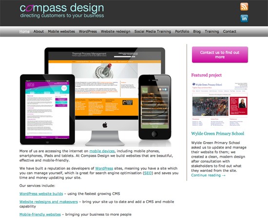 The layout designed for tablets is more unusual. The navigation menu’s layout changes to fit all of its content in the available space for tablets in portrait orientation:
 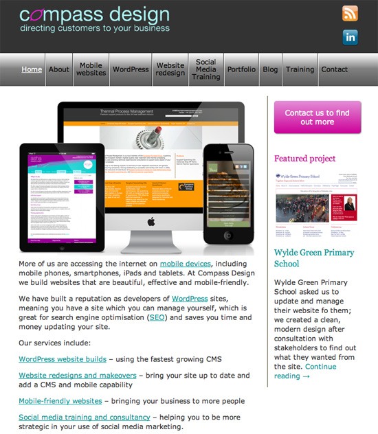 And the layout intended for smartphones is different too, this time with a link to the navigation menu which is responsively moved to the bottom of the page:
“My responsive design stopped working!”
Since the time the site was designed, the range of devices used to access it has grown quite rapidly.
For example:
- The iPhone 5 is 568px wide in landscape mode
- Many Android smartphones have large screens (such as the Samsung Galaxy, which is 380x685px)
- Smaller tablets have been released since the time my site was originally designed, tablets with a 7” screen and not a 10” screen (although some of these, such as the iPad mini, still work as if they have the same pixel dimensions as their larger counterparts)
Let’s have a look at the site on iPhone 5. Because iPhone 5 is wider than 480px in landscape mode, the smartphone is using the layout designed for tablets, which renders a broken navigation menu: 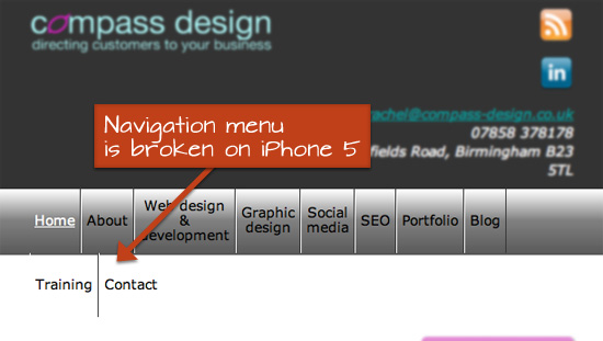 This demonstrates the point I’m trying to make: Using devices as the guide for our web design’s responsiveness doesn’t work. It especially doesn’t work if we care about future-proofing our work. As the number of devices continue to grow, it will be impossible to predict what our designs will be viewed on.
And not only is it impossible to predict what new devices are going to enter the market, it should be unnecessary to do so anyways when it comes to our web designs. What we need to do instead is identify the points at which our web design stops to work the way we want it to, and then set our responsive breakpoints there.
Design-Based Media Queries in Action
The new media queries for my site are based on two guiding principles:
- The content layout needs to adapt to whatever the device width is, so that the content is easier to read.
- On touchscreens and mobile devices: Navigation menu items need to be large enough so that users can easily interact with them.
The desktop layout includes a full-width navigation menu. This layout works down to 1005px, at which point some of the navigation menu items start to stray below each other, as shown below:  Because this particular web design breaks at exactly 1005px due to the amount and lengths of its navigation menu items, I’ll set the breakpoint there:
/* Breakpoint #1 for medium-sized screens */ @media screen and (max-width: 1005px) { } Note that in my stylesheet comments and also in my two guiding principles, I have removed any references to any particular mobile device. Working down in width, the layout breaks again at 745px, as you can see in this screenshot: 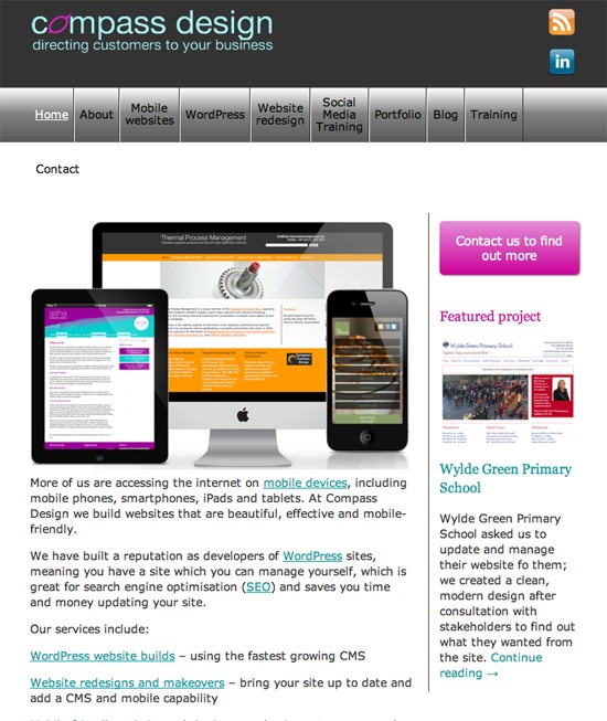 So I set another media query breakpoint at 745px:
/* Breakpoint #2 for small-sized screens */ @media screen and (max-width: 745px) { } The layout now works at 745px wide: 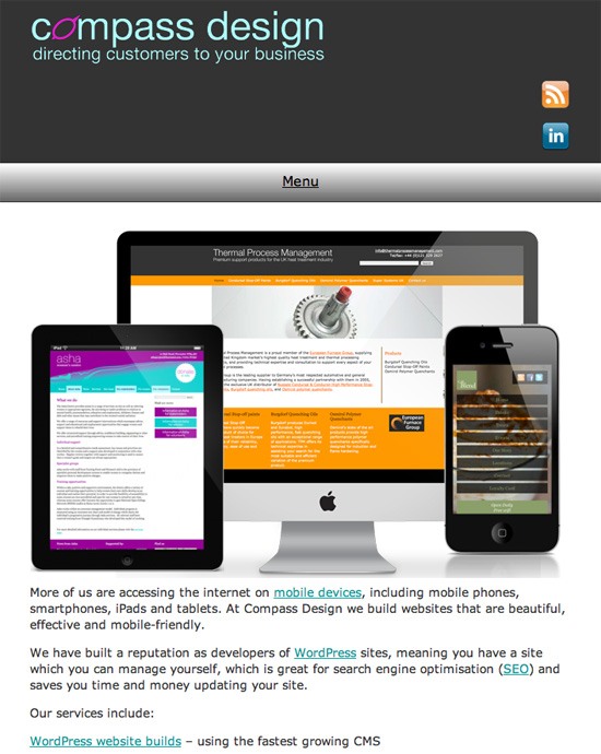 The site now has a set of breakpoints which are completely device-agnostic and ensure that the design will adapt the best way possible to any device.
The specific technique for design-based media queries I showed you just now needs refinement, especially for sites that continually update their navigation menu and content. The important idea is this: We should choose media queries based on the design, not based on specific devices.
Moving Towards a Universal Web
The idea of design-based media queries is a very simple one.
And adopting the concept in a web design project can be as rudimentary as resizing your browser window to the point where the layout breaks, and then setting the media queries at that point, as in my case. The “standard” media queries we’re currently using conveniently ignore the growing range of devices that don’t conform to the dimensions Apple, Samsung, Sony, and other device vendors have chosen for us. Media queries based on specific devices won’t allow us to build sites that are future-proof and device-agnostic.
If we want to continue to uphold the essence of what’s great about the Web, to continue to create a Web that is universal — a Web that isn’t being driven and led by a particular mobile device, or web browser, or company — then one of the things we can do is move away from device-specific media queries.
Related Content
-
 President of WebFX. Bill has over 25 years of experience in the Internet marketing industry specializing in SEO, UX, information architecture, marketing automation and more. William’s background in scientific computing and education from Shippensburg and MIT provided the foundation for MarketingCloudFX and other key research and development projects at WebFX.
 -

WebFX is a full-service marketing agency with 1,100+ client reviews and a 4.9-star rating on Clutch! Find out how our expert team and revenue-accelerating tech can drive results for you! Learn more
Make estimating web design costs easy
Website design costs can be tricky to nail down. Get an instant estimate for a custom web design with our free website design cost calculator!
Try Our Free Web Design Cost Calculator
Share this article


Web Design Calculator
Use our free tool to get a free, instant quote in under 60 seconds.
View Web Design CalculatorMake estimating web design costs easy
Website design costs can be tricky to nail down. Get an instant estimate for a custom web design with our free website design cost calculator!
Try Our Free Web Design Cost Calculator


