Breaking Out Of The Box: Design Inspiration (June 2016)

Email Newsletter
Weekly tips on front-end & UX.
Trusted by 200,000+ folks.

 Flexible CMS. Headless & API 1st

 Register!
There’s no doubt that simple design is hard, since it requires much more thought and inspiration. It’s about understanding exactly what your users need. Colors play a major role, and today I’d like to show you a couple of illustrations that may motivate you to try out some new color combinations and techniques.
Take a look at the following photographs, posters and book covers that have been created with some really inspiring shades and color palettes, and some even show how to cleverly use negative space. From 3D illustrations to artwork created with ink and watercolors, I’m sure there’s something that’ll spark your inspiration. Be warned though, some of them may even give you wanderlust from just looking at them.
A Writer, A Hero
Clever executed light & shadows. The typewriter and the gun are super cool. Just enough details to be convincing.
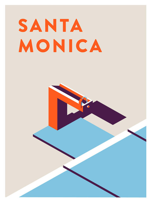
Santa Monica
Illustration based on water fountains in Santa Monica. It’s the illustrative interpretation of Jeremy Booth. The shadows & light are like his trademark to recognize the work is his.
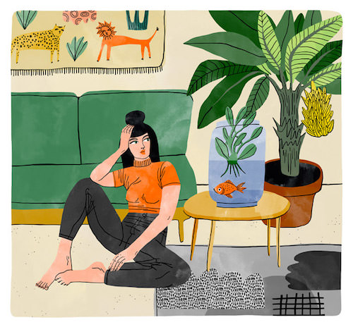
Girl - Goldfish
Refreshing style especially if you know it isn’t created on a computer. Bodil Jane is an illustrator from the Netherlands who creates almost all of her illustrations with ink and watercolors.
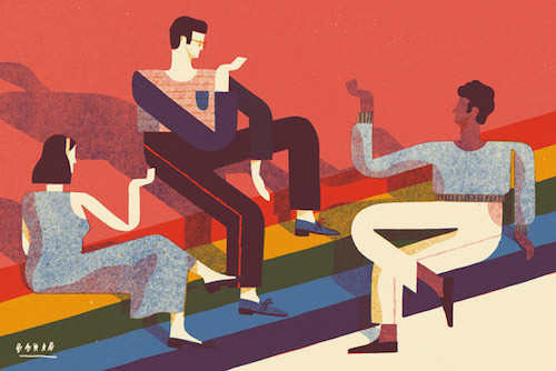
The Upshot
Illustration for The New York Times about an article that talks about how the same-sex marriage effort found a way around polarization. The legs and arms are such an eye-catcher here. I love the geometry and the way the colors are applied.
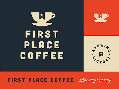
First Place Coffee
Identity for First Place Coffee. Smart how the star ribbon is cut out in the coffee cup.
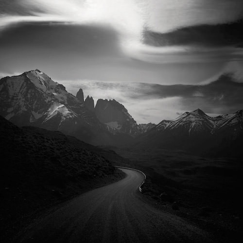
Patagonia Dreaming II
Black and white photography can be super powerful. The mountains are of course a very thankful subject to work with as well. The light is so perfect in this photo. It creates this mystical atmosphere.
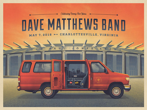
Dave Matthews Band 25th Anniversary
Insane amount of details in this poster to celebrate the fact that the Dave Matthews Band has been performing for 25 years. The texture on the car to get those details in are seriously inspiring.
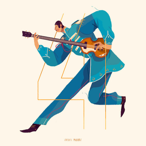
36 Days. Numbers
A beautiful example of character design. The distinctive feature here is the small head in combination to a much larger body. Great colors too. Be sure to check out the other characters as well.
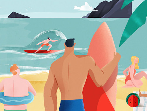
Playa/Beach
Just looking at this wonderful piece makes me happy. A very tasteful color palette to begin with followed by analysing those lines with the darker parts on the body. It looks easy, but I can assure it isn’t. Those waves! Gorgeous work.
Apple Flavor
After that beach scene we all could use an ice-cream right? Lovely humorous T-shirt concept. The bite marks make it look like it was delicious. A beautiful piece of 3D style that still have a certain flat style flair.

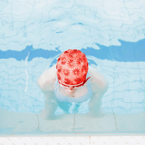
Swimm - Maria Svarbova
Love how color gets the lead actor role in this photography. It’s applied smartly also in those other shots.
2cv Dyane Camping
Some cute details to discover in this artwork. I especially like how the 2cv dyane is drawn.

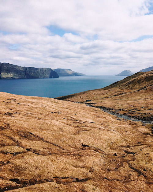
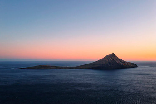
Faroe Islands I
The Faroe Islands seems like a nice place to snap some beautiful pictures. Love how the color of the water contrasts so nicely with the soil/grass.
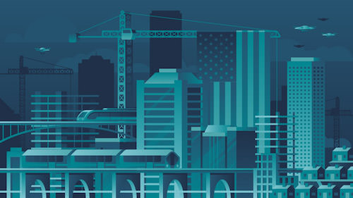
The New New Economy
So good and so much detail. Adore the minimal color choices, subtle gradients and shading. Lovely geometry and flat 2D design.
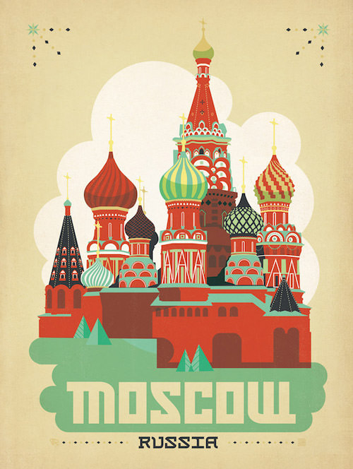
Moscow - Russia
The colors let this vintage travel poster shine. The way how the structure of the buildings are created is also very inspiring.
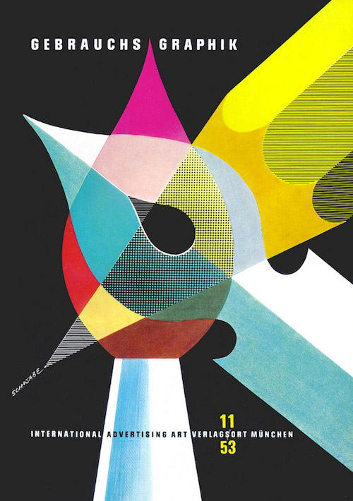
Gebrauchsgrafik 11-1953
Created by Heinz Schwabe in 1953 for Gebrauchsgrafik. The pre computer era of graphic design when everything was created by hand using pen & pencils/crayons. The items you also see in this poster. Beautiful colors.
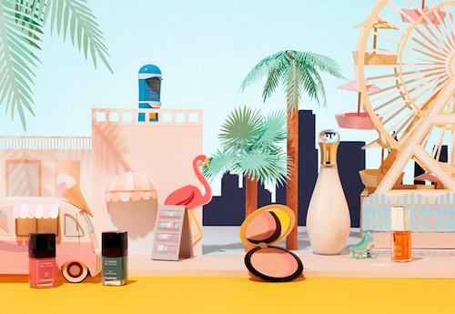
Summer Ici Paris XL
This new work for Ici Paris XL is using miniature versions of Miami and Santa Monica created in cardboard. The products are the actors in the artwork and they blend in so nicely. Nice use of colors!
Faroe Islands II
If you need proof that nature is a master in creating the nicest gradients, this picture on the Faroe Islands by Dan Rubin would be it. Just look at that!
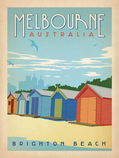
Melbourne - Australia
Another one from the classic travel poster collection. In this one the typography and the colors are the stars.
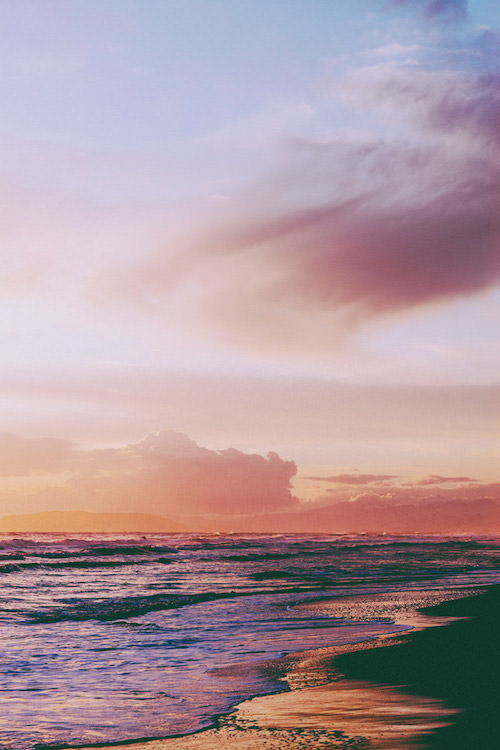
Dreamy Twilight
I hear the sound of the waves in this lovely scene. Another example of wondrous gradients, and color palette. Warning! You may get wanderlust from looking at this photo.
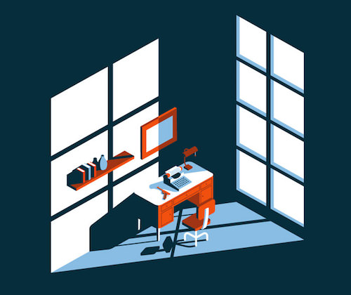
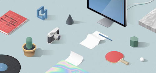
Stinkdigital Illustrations
One of the nicest 3D illustrations I have seen lately. All items are perfectly placed and laid out on the isometric grid. Perfect shadow and light, and great soft color tones too. Be sure to check out the other ones as well.
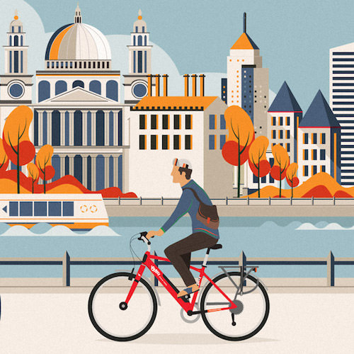
Emu Bikes
A series of illustrations created for Emu Electric Bikes and their advertising campaign, showing the bikes in the various environments of the countryside, suburbia and the city. The red of the bike draws the attention. The trees and other ‘green’ have an interesting more organic shape and contrast well with the other shapes. They are in sync with the guy on the bike, and the lines of his bag.
How To Manage Your Checking Account
What an awesome idea to use a revolving door to illustrate ‘how to manage your checking account’. I also very much like how the darker color is giving the figures a bit of volume. Again, perfect shadow and light which makes it so beautiful.

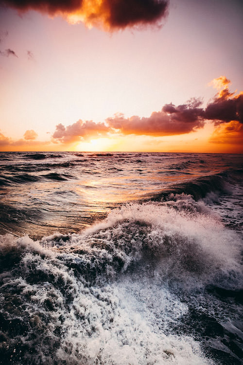
Soft And Furious
Just imagine you are there. Those orange fire in the sky tones are pretty spectacular. Nature can be so amazingly colorful sometimes, especially during sunsets or sunrise places like this.
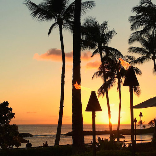
Summer Evenings
Beautiful shot to represent the best time of the year where one can enjoy those lovely long Summer evenings. Best ones are on the beach of course. Sunsets can be so beautiful. They’re moments to suck in, stand still and escape the real world.
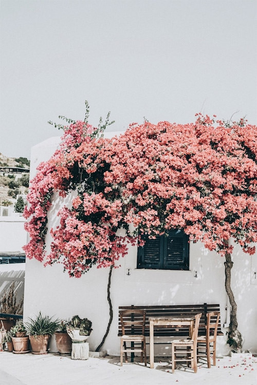
Weekend Edit
Speaking of Summer, here’s a shot to get some wanderlust. A fine example of some clever post processing. The sky is muted, but those flowers are still vivid. Looks easy, but it is an art to find the right balance.
H’University
Very cool illustration for H’University. Loving the ripped pants and sport shoes. It has a certain coolness to it. Also the simplicity of how everything is drawn, using these dark borders, and the patterns on the clothing gives this illustration an extra punch.
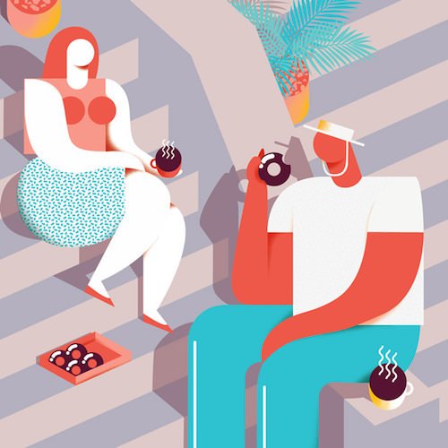
Budget Party Ideas - Summer In The City
Bold geometric shapes, bright colors, and voluptuous vacationing characters are giving this illustration a whimsical and sultry personality.
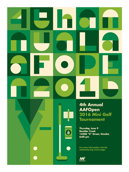
4th Annual AAFOpen Mini Golf Tournament Poster
Poster for the 4th Annual AAFOpen Mini Golf Tournament. Very well executed as you can see the courses in the letters and the green jacket that the winner takes home.
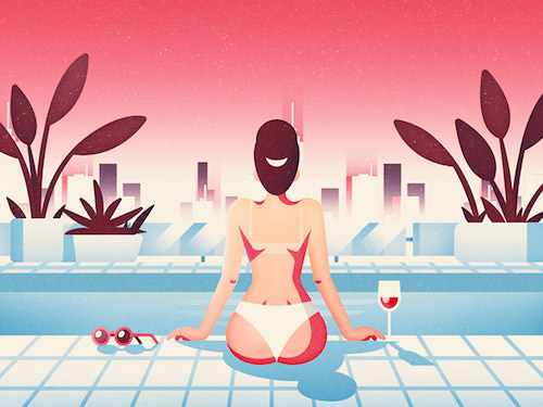
Drink By The Pool
Lovely scene with a basic city skyline in the back. Works perfectly with the pink sky. The dark plants adds the perfect color balance and contrast. Shadows and textures are inspiring too.
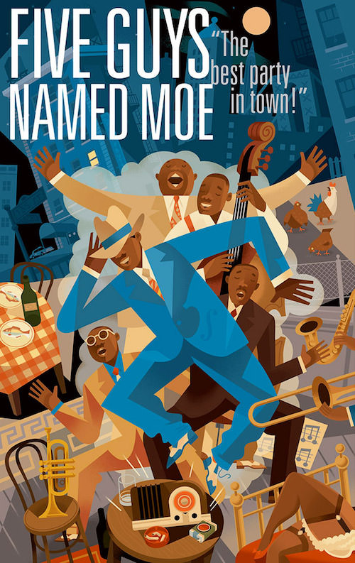
Five Guys Named Moe
Poster for musical revue “Five Guys Named Moe” Arena Stage Washington DC. A very inspiring color palette being used here matched with elegant use of darker areas. This illustration is simply amazing. I can keep looking at it all day.
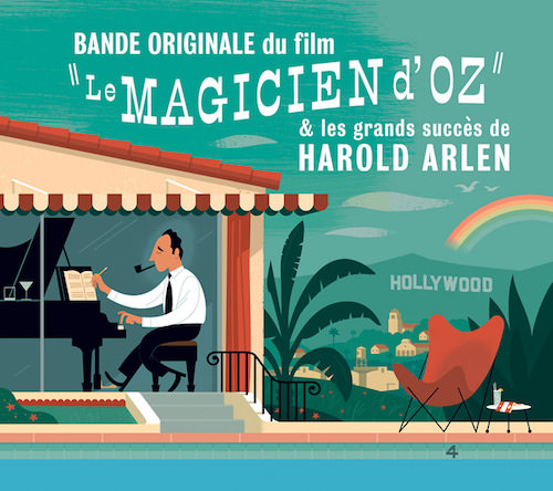
Harold Arlen
CD cover for a collection of songs written by Harold Arlen, Milan Records, France. The butterfly chair originally designed in 1938 plays a prominent role in this scene, almost as prominent as Harold Arlen himself. The backdrop is also nicely executed.
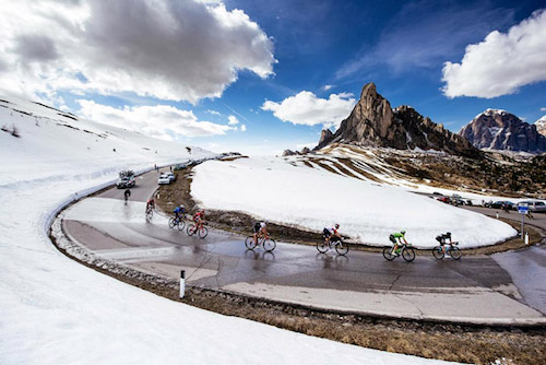
Ustaria Posta
I love the Dolomites. One of the nicest places in the world, especially through the lens of Ashley and Jered Gruber. Taken at the Giro d’Italia.
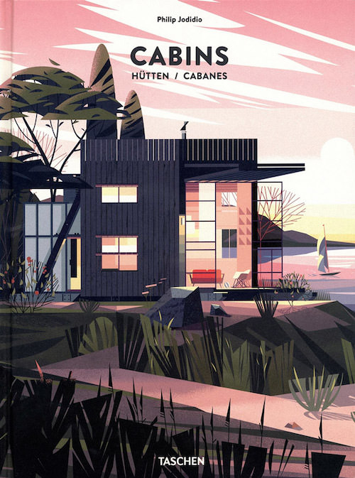
Cabins- Taschen
The blocky geometric shapes and flat colors are joyful and confident, but a certain restraint of going too detailed. They fully illustrate the natural silence and placidity of a cabin in the woods.
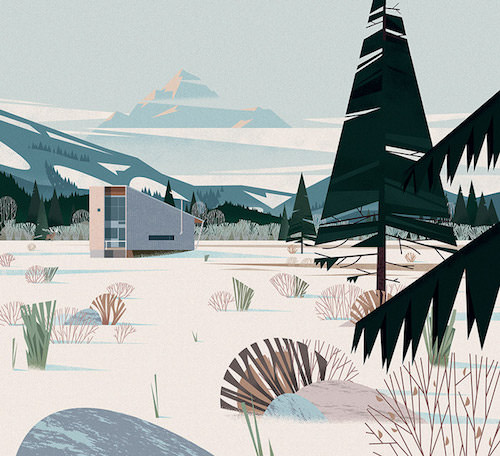
Cabins- Taschen II
What I especially love about these illustrations from Marie-laure Cruschi is that there isn’t as good as no roundness to be found. Everything has these sharp edges, but she still manages to keep it all elegant. Her color palettes are always so perfect too. Very inspiring.
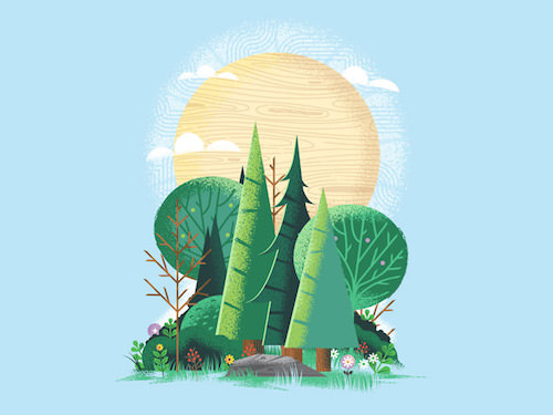
Tree Grove Study
This looks great thanks to such a nice composition. I also admire the use of textures here especially in the sun.
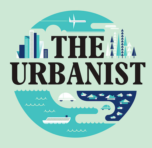
Monocle 24 Radio
Illustration for Monocle 24, the Internet radio station from London based Monocle. The typography works hand in hand with the illustration. The shapes of the houses, car and boat are very original.
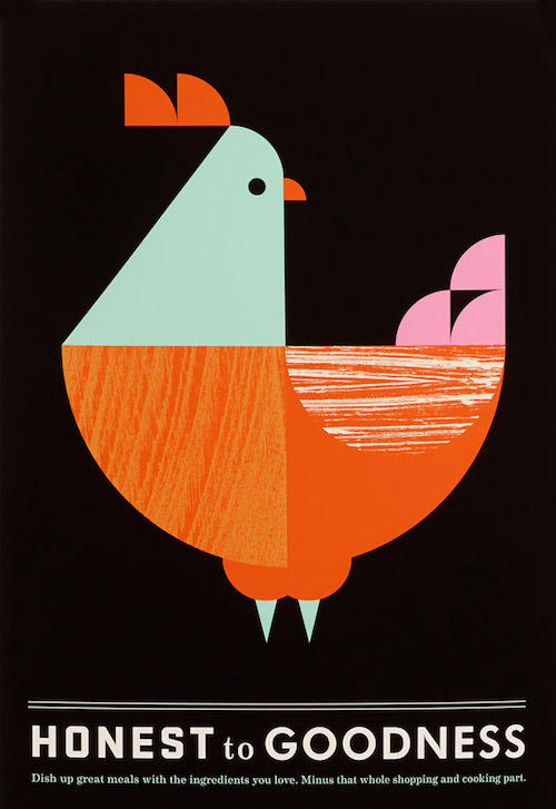
Honest To Goodness
Nice artwork for The Kitchen, the prepared-foods division of Whole Foods Market. The illustration is part of a visual identity system that spanned everything from identity and packaging to custom illustration and signage. I love the simple shades and color palette. The black background works really well. See it all.
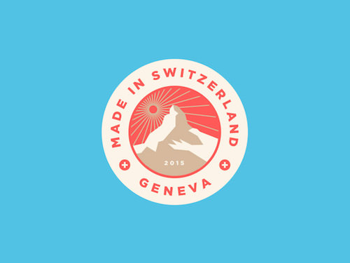
Swiss Made
Interesting color palette especially with the sun being the same color as the shadow side of the mountain. Works well in this case.
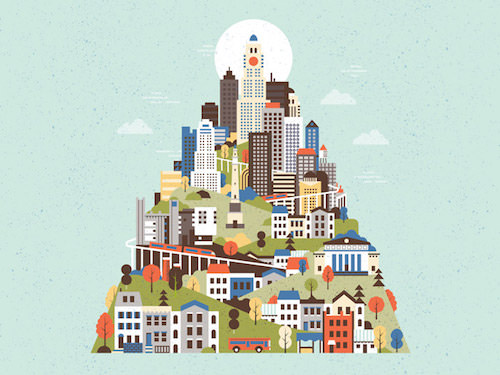
Commissioned Cityscape
Much to like here in this custom illustration. Architecture plays a leading role in this piece with some of the more iconic buildings like from Yale, Chicago, and New York to create the cityscape. The face you see in the top tower is a nice touch.
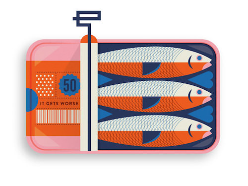
Sardines
Beautiful work! An illustration with delicious details. I adore the lines on the sardines. Subtle textures just in the right amount. Who says orange can’t be combined with pink? Don’t they work well together here! It’s all a matter of how you apply colors.
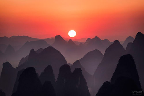
Guilin
Check out this stunning photograph by Kyon.J, captured from high above the city of Guilin, China. It almost doesn’t look real.
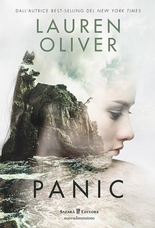
Lauren Oliver’s Panic
The mission was to create an intriguing and visually appealing cover illustration. Mission accomplished with this collage. It draws you in and you wonder what’s the story.
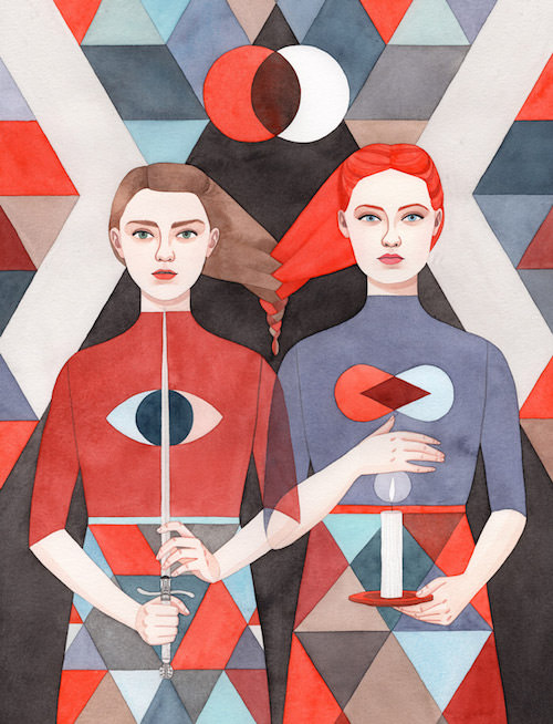
Sisters: Arya & Sansa
Interesting interpretation of the Game of Thrones sisters. Excellent colors and lines at work here. All resulting in a beautiful kinda watercolor style.
Sunrise-ish
Perfectly framed and pure tranquility. Love the soft pinkish tones of the clouds against the sky and horizon. Also the reflection in the water creates this nice gradient (again).
Material I
Matthias is a regular in my inspiration stream. He just published some new work where he captured architecture, places, and scenes taken in the cities of Tokyo, Seoul, Berlin, Leipzig, Lisbon, Milano, Rome. He has such an interesting eye as he’s able to transform these places, that many of us would otherwise just pass, into interesting compositions.
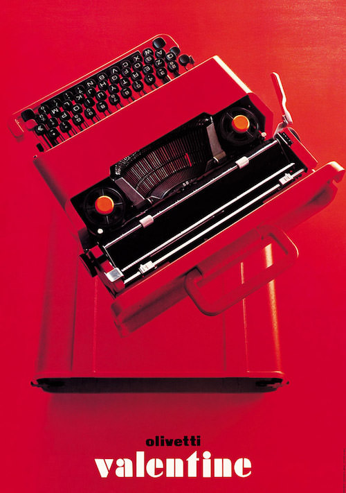
Olivetti - Valentine
Olivetti has always understood the skills to use graphic and interior design to communicate its products. This poster for the Valentine typewriter, designed by Walter Ballmer (1969) is part of a new exhibition on the design and architecture of Olivetti, opening at the ICA in London and runs until July 17.
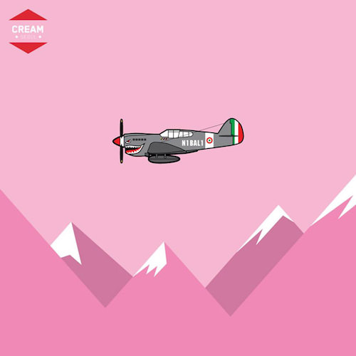
N1BAL1
The shark is back. The (cycling race) “Giro d’Italia” is done and dusted. It was another unpredictable edition with Vincenzo Nibali making a come-back to remember in the few last days. This illustration celebrates that, and refers to Nibali’s nickname ‘The Shark of Messina’.
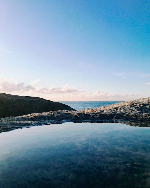
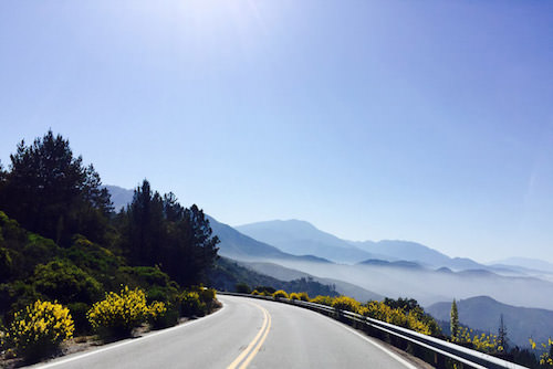
Big Bear Lake
My niece has travelled to the Big Bear Lake this Memorial weekend, and send me this photograph of the amazing scenery along the way. Makes me want to book a trip to California.
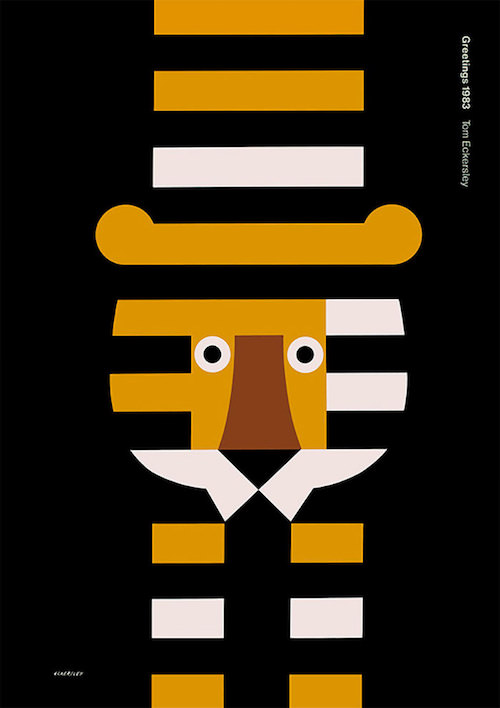
Greetings 1983
Poster from Tom Eckersley, a giant in the British graphic design history. Clever use of negative space. Simple design is hard. This one proofs it.
Further Reading
- Art Inspirations with Individual Artist Portfolios
- Beautiful Black and White Photography
- Beautiful Photoshop Illustrations By Artists Around The World
- 35 Brilliant Examples of Rain Photography


