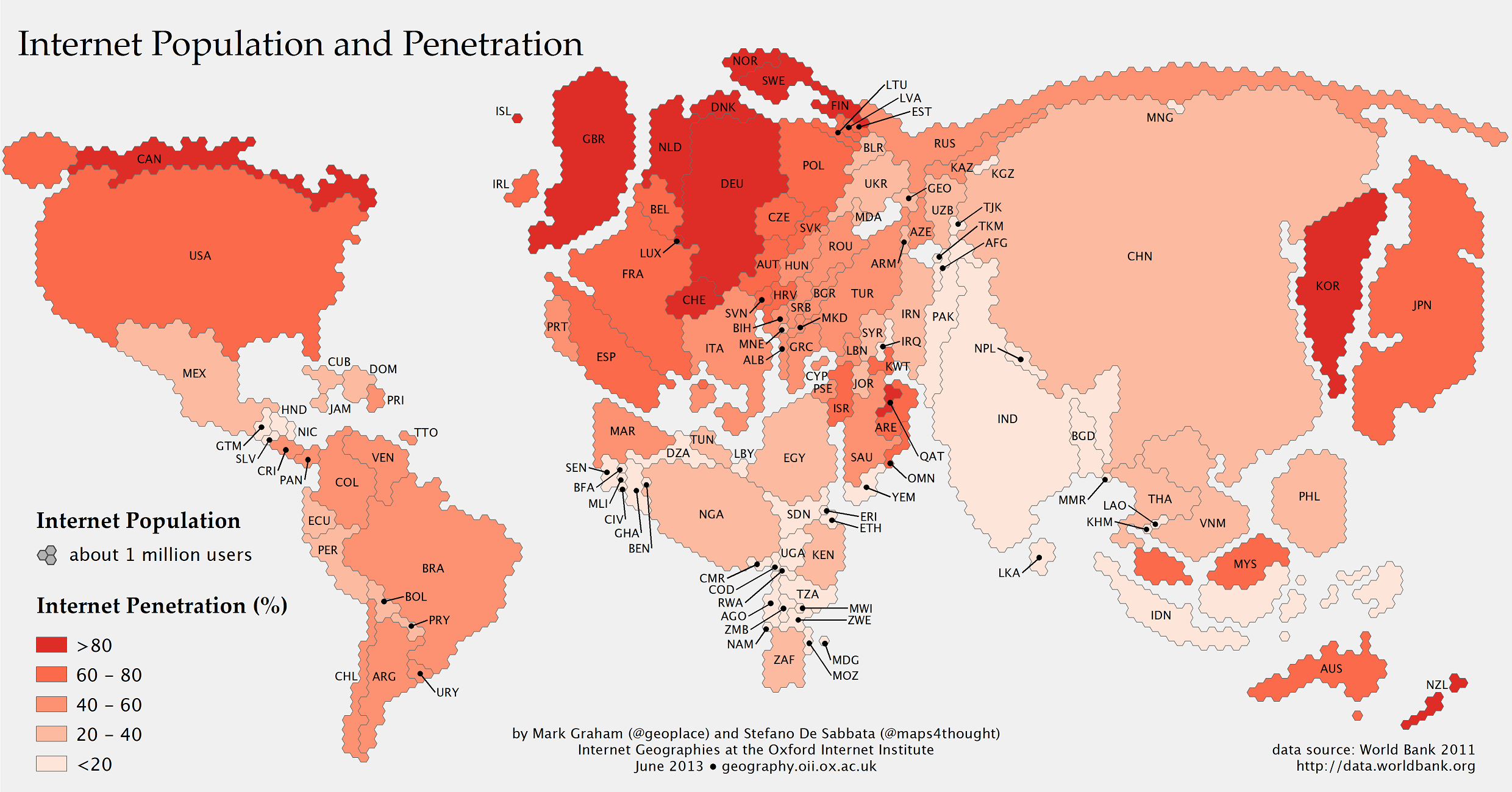
What the World Would Look Like If Countries Were As Big As Their Online Populations
Helloooooo China!
The Internet we each see every day is an infinitesimally tiny sliver of the whole—the parts we have curated for ourselves, the parts our network of friends and family sends to us, and the sites that we have made parts of our routines.
But beyond this micro-level editing, there are also macro forces at work: The Internet largely exists for and is created by the people who are on it. The map above gives a rough idea of who those people are—or, at least, where they are.
The map, created as part of the Information Geographies project at the Oxford Internet Institute, has two layers of information: the absolute size of the online population by country (rendered in geographical space) and the percent of the overall population that represents (rendered by color). Thus, Canada, with a relatively small number of people takes up little space, but is colored dark red, because more than 80 percent of people are online. China, by contrast, is huge, with more than half a billion people online, but relatively lightly shaded, since more than half the population is not online. Lightly colored countries that have large populations, such as China, India, and Indonesia, are where the Internet will grow the most in the years ahead. (The data come from the World Bank's 2011 report, which defines Internet users as "people with access to the worldwide network.")
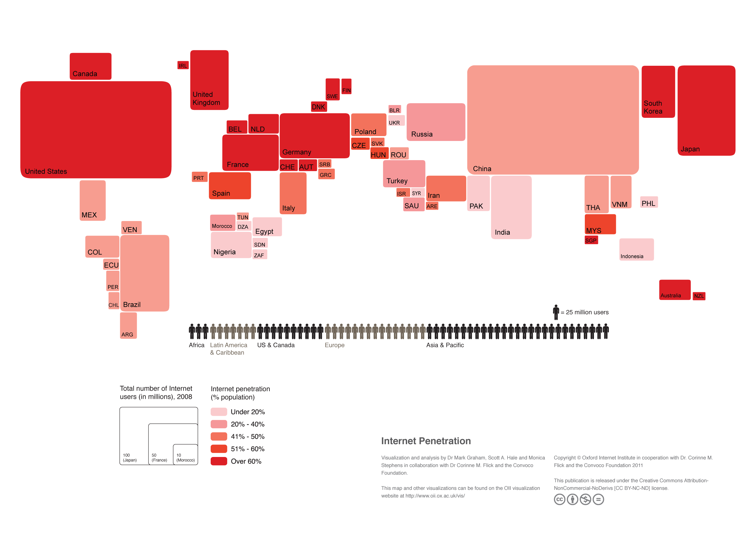
Another map, from Nature (in 2006, so slightly outdated), provides a good point of comparison. This map shows countries by their population size, visually portraying the data that the shading in the first map is based on:

China, of course, dominates both. But what is interesting in comparing the two is how outsized Europe and South Korea are in the Internet population map, captured in their darker shading. In fact, all but four of the countries with more than 80 percent of their populations online are in Europe: South Korea, New Zealand, Qatar, and Canada. Together with much of Europe, these are the parts of the world that have gotten the vast majorities of their people online the fastest.
Mark Graham and Stefano De Sabbata, the creators of the top map (and also of the “Internet Empires” map from last week), highlight two additional trends:
First, the rise of Asia as the main contributor to the world’s Internet population; 42% of the world’s Internet users live in Asia, and China, India, and Japan alone host more Internet users than Europe and North America combined.
Second, few of the world’s largest Internet countries fall into the top category (>80%) of Internet penetration (and indeed India falls into the lowest category, at <20% penetration). In other words, in all of the world’s largest Internet nations, there is still substantial room for growth.
They also note that although many African countries appear relatively very small on the Internet penetration map, many of these countries have experienced the fastest growth since their last such map, from 2008, when they didn't even appear:
Graham and De Sabbata write:
In the last three years, almost all North African countries doubled their population of Internet users (Algeria being a notable exception). Kenya, Nigeria, and South Africa, also saw massive growth. However, it remains that over half of Sub-Saharan African countries have an Internet penetration of less than 10%, and have seen very little grow in recent years.
The portrait of the world that the map depicts is one of very uneven access to the Internet, with the vast majority of people disconnected from this global network. Bear in mind, the authors say, that overall "only one third of the world’s population has access to the Internet."