A Guide to Shooting Portraits with Kodak Ektar 100
Kodak Ektar is the reason I fell in love with film photography. My first roll completely blew all of my digital shots out of the water. I was used to the ugly JPEGS that my old Nikon D40 spat out and Ektar just gave me what I wanted — sharp pictures, with silky grain and a look that I didn’t know how to edit for.
I followed the recommendation I received by the person who sold me it: use it to shoot things and places and was not disappointed:
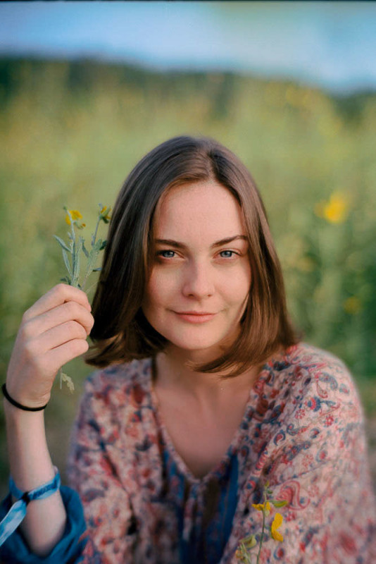
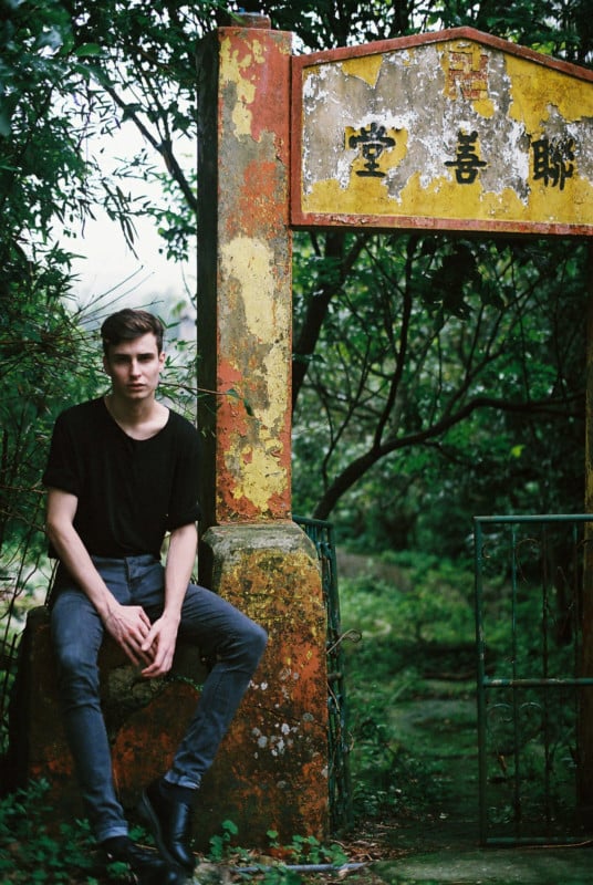
The tones are fantastic, with dark shadows and highlights that retain their detail. The sharpness and grain are top notch.
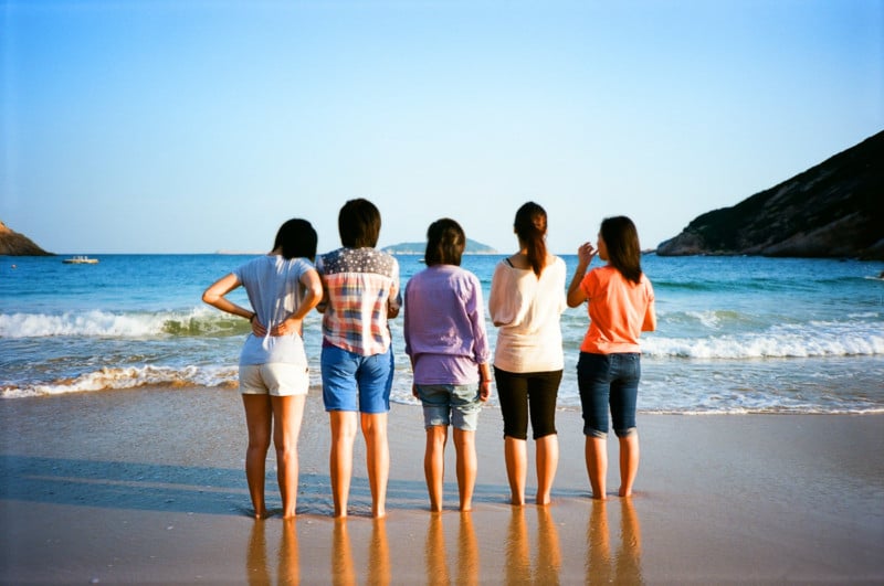
But the real reason to use Ektar is the color. Golden hour looks truly golden with this film, contrasted with beautiful, calming blue notes.
But when it comes to shooting people Portra is the far more popular choice for most. Not that I don’t think it has its place as a film stock, but I have scanned so many rolls of other people’s Portra that I’m tired of the look that it renders. Portra seems like a ‘safe’ choice, and it’s pastel colors and muted tones can diminish the potential of a vibrant scene that I find so appealing in a portrait.
Many will insist that Ektar is a landscape or still life film and that its tone is too red to capture pleasing skin tones. I completely disagree: Ektar is made for the digitization, and is optimized for scanning and adjustment. If you know how to expose it properly and manage your color space you can take beautiful portraits with it.
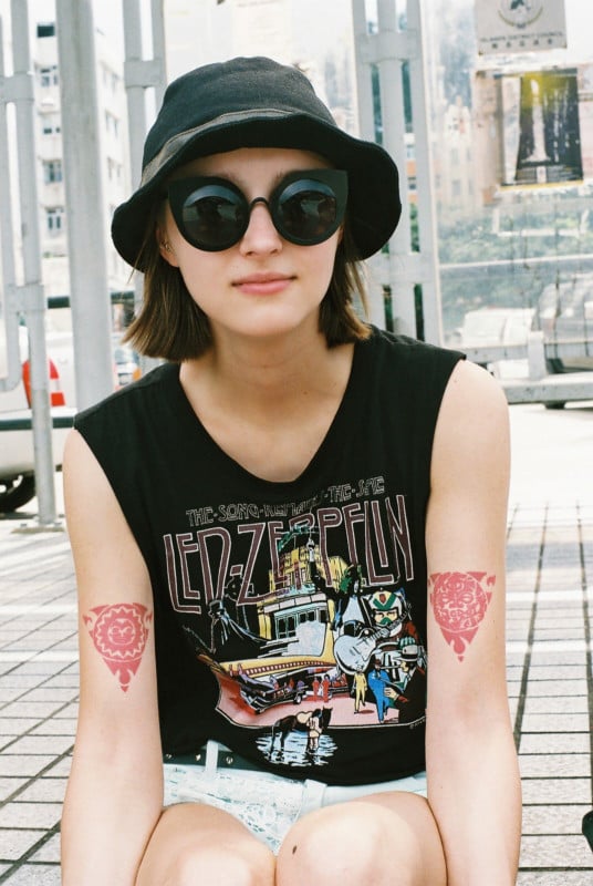
That common complaint of too much red saturation can be resolved by overexposing your skin tones by ⅓ of a stop and shooting in white or yellow light to balance the saturation of red. Meter at box speed and avoid shooting in heavy shadows. Also — I usually lose the lens hood — the additional saturation they give is not what you want for pictures of people.
If you’re still finding the red too saturated, you can also ask your lab nicely to try to take more red of their scans. I also recommend finding the right scanner for the job — I find that the Fuji machines don’t do as good a job as Noritsu when it comes to rendering Ektar in the most balanced color space. You can check what machine your lab uses by looking at the metadata in Lightroom.

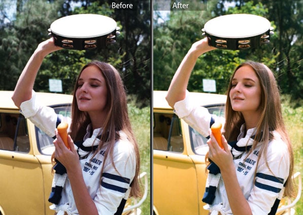
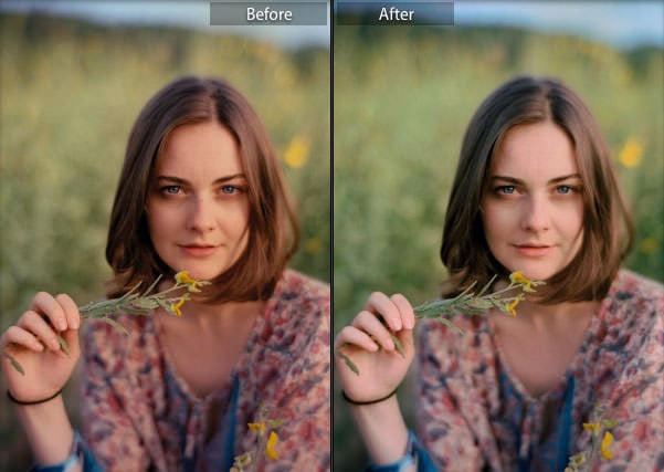
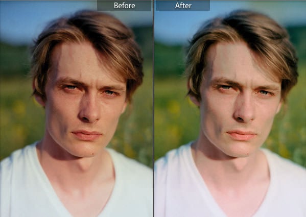
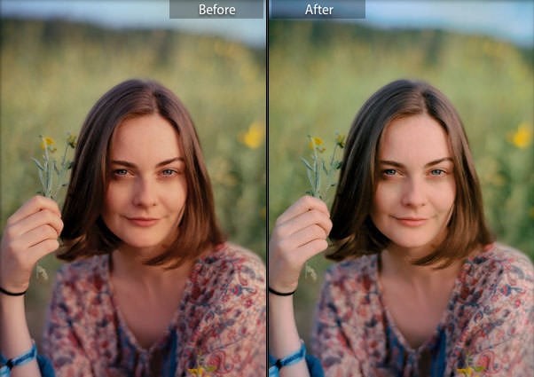
If your raw scan isn’t color fixed for skin tones, you can always adjust in Lightroom. I have a preset which you can download here that I used to fix my portraits, but this may still need a bit of tweaking to get the look you desire.
The following images I shot at Wonderfruit Festival in full sun (both Anna and I had to try not to squint while looking into the camera. My Taipei lab does not leave metadata on my files, but I have a feeling that the scanner they used was a Pakon 135, judging by the look of the color. The examples below demonstrate before and after my Lightroom color fix.
So there you have it: Ektar is a bold and interesting film, with striking color and great versatility. It’s much like shooting a slide film like Provia, with a greater dynamic range and much lower cost. Ignore those who will tell you its only good for landscapes — shot the right way, it can be used for all situations and used to great effect for portraiture.
About the author: James Cater is a digital and analog photographer, film lab operator, and model. The opinions expressed in this article are solely those of the author. You can find more of Cater’s work on his website and Instagram. This article was also published here.