For several years after its launch, one of the best and worst things about the iPad was that it was basically just a blown-up iPhone. This meant the device was extremely easy to use and intuitive, but it also meant lots of “computer-like” tasks were difficult to perform on an iPad. When the iPad Pro debuted in late 2015, that began to change. Features like Split View, Slide Over, Picture in Picture, and drag and drop made the iPad a more capable computer than ever. However, despite those advancements, it took until this fall before one of the iPad’s core iPhone inspirations was altered: the Home screen.
Before iPadOS, the iPad’s Home screen was just a larger version of an iPhone Home screen, with no unique advantages to it. That finally changed mere months ago, when iPadOS 13 brought two primary improvements to the Home screen: it could hold 30 icons rather than 20, and it could include pinned widgets.
These two changes alone weren’t radical departures from the Home screen’s iPhone origins, but combined with other discoveries, they unlocked significant new possibilities.
On a recent episode of Adapt, I challenged Federico to try re-creating a Mac-like desktop environment on the iPad’s Home screen, complete with file and folder launchers. What he came up with is exactly what I’d hoped for. This newfound ability, alongside iPadOS 13’s enhancements to how shortcuts work when added to the Home screen, and the debut of MacStories Shortcuts Icons, meant it was time for me to seriously consider a new approach to my Home screen.
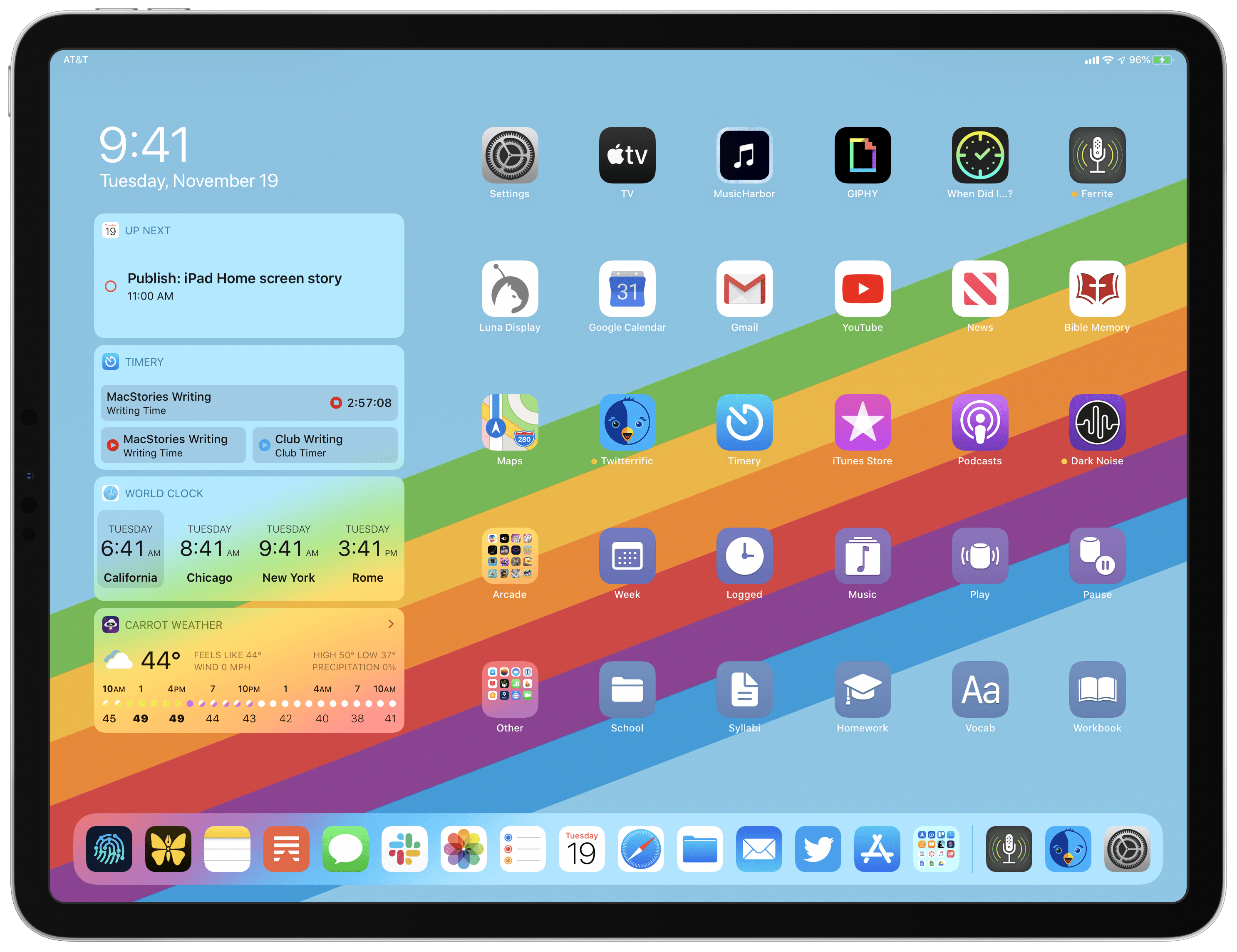
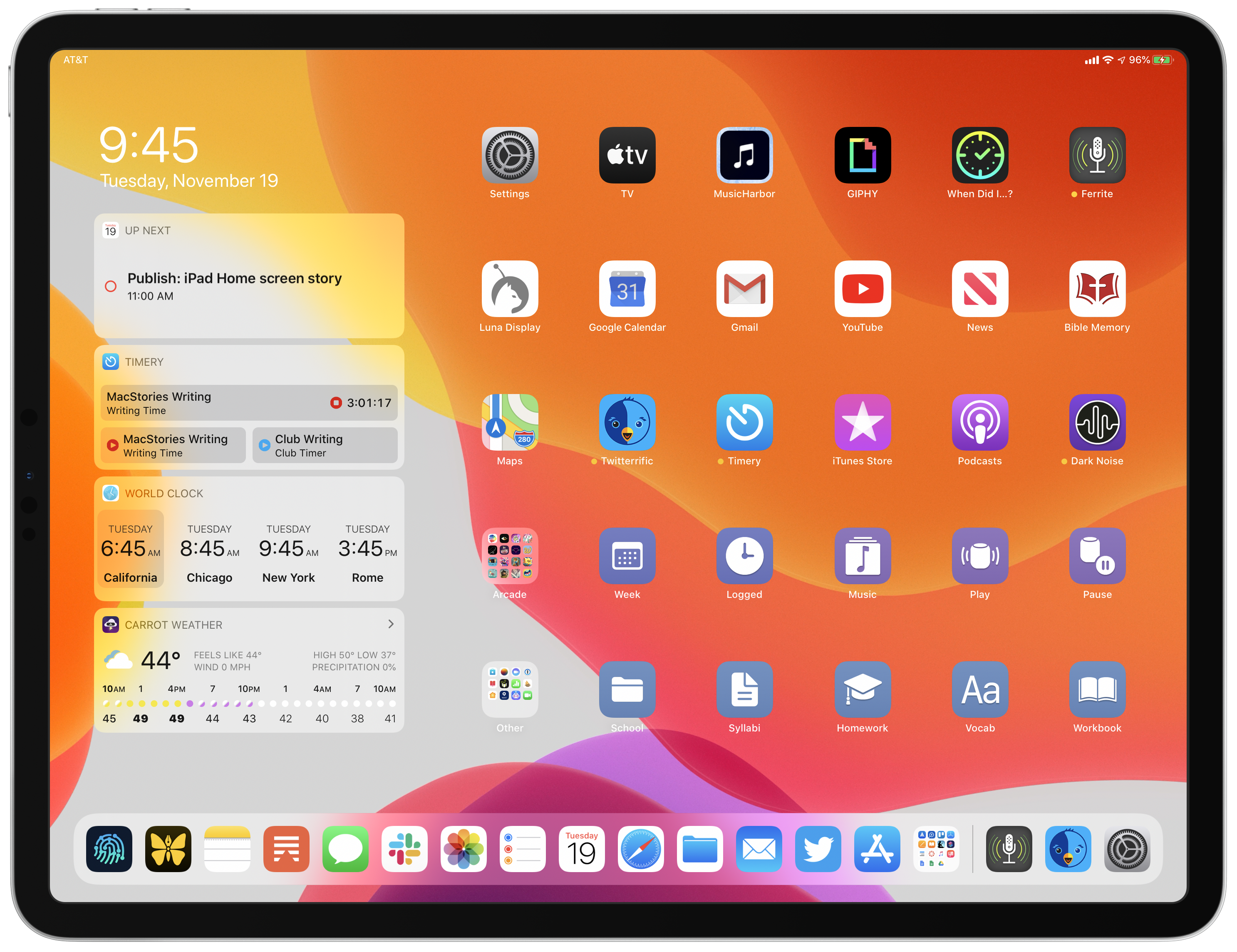
What I’ve come up with includes apps, app folders, files, file folders, shortcuts, and of course, widgets. It’s a diverse setup, and it all lives on a single page of icons. Let me explain.
Dock
Like with all modern iPad Home screens, the most important part of my Home screen is the dock. With the exception of some apps in my dock’s folder, the dock only contains apps that I use on a daily basis, typically many times each day. There are some daily-use apps that aren’t in my dock, and instead reside in my Home screen’s grid, but those are apps I typically only use in fullscreen. Since the dock is the easiest way to add apps to Split View or Slide Over, I reserve its limited space for apps I regularly multitask with.
I won’t go into much detail about the specifics of apps in my dock, because most of them are familiar to you already. I use a lot of first-party apps, partly because I tend to agree with many of Apple’s design decisions, but also because of how seamlessly these apps work across a variety of devices – iPad, iPhone, Watch, HomePod, and Mac.
As for the apps you may not recognize, from left to right:
- Working Copy is in the first slot. It’s a Git client the MacStories team uses to collaborate on draft stories that are saved in shared Git repositories; Working Copy is a file provider in Apple’s Files app, so I can easily access Federico or John’s works in progress from any Markdown editor supporting Files’ document browser.
- Ulysses is listed second; it’s my writing app of choice for everything that I eventually publish, whether that’s MacStories or Club MacStories articles, Adapt show notes, or even essays for school. I love so many of the design choices Ulysses makes, it would be hard to use anything different if the app ever went away.
- Morning Reader is fourth in my dock, a tech news aggregator that keeps me apprised of the latest noteworthy stories in tech. The app lists five top stories and five recent stories in a single view, which is constantly updating, and tapping one of the stories opens it in Safari. It’s an extremely simple utility, but I use it countless times each day.
- Twitter, the first-party client, is also in my dock. It’s not for everyone, but I love what Twitter’s development team has been doing for the last few years. I switched to the app in April 2017, and it just keeps getting better.
My lone dock folder has a slightly humorous backstory. Historically I haven’t used folders in my iPad’s dock, because when I first tried one during the iOS 11 beta cycle, dragging an app icon out of a folder, for the purpose of adding that app to Split View, wouldn’t automatically dismiss the folder. That bothered me, so I stopped using a folder in my dock. Little did I know that Apple fixed this issue years ago.
When I learned this spring that the problem was fixed, I started using a folder in my dock again. Unfortunately, less than a month later, the iPadOS 13 beta re-broke functionality in the same way as before: dragging an app out of a folder would require manually dismissing the folder. Again, I reverted to keeping no folder in my dock…until the issue was fixed again, this time in iPadOS 13.2. So the folder’s back for now. Who knows how long it will last this time.
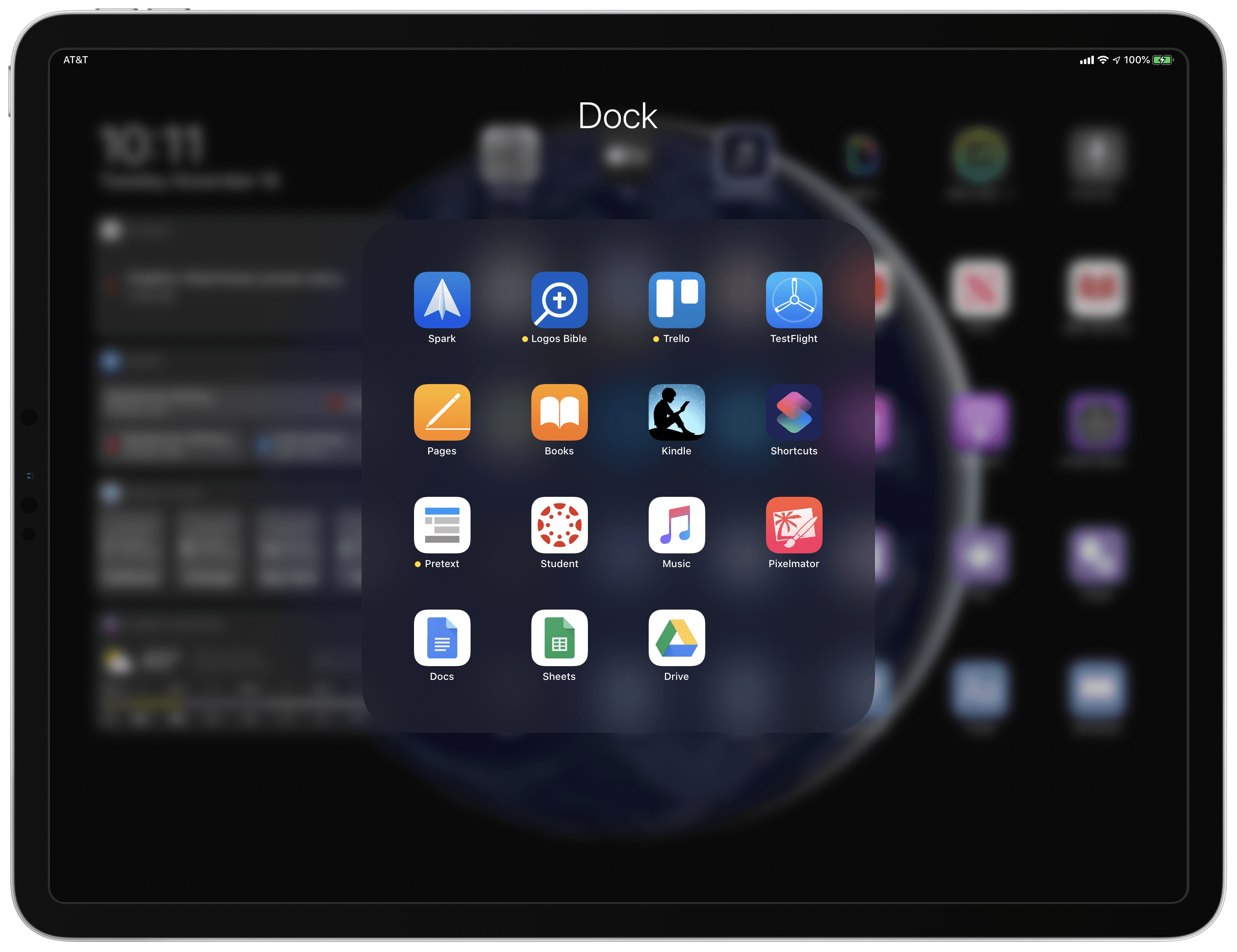
Inside my dock’s folder I keep apps that I launch a lot and that I use in Split View or Slide Over regularly. If I didn’t multitask with these apps often, they would belong in my Home screen grid instead. Noteworthy apps:
- Spark is the email client I use for my MacStories email, entirely because of its excellent team-centric features that I haven’t found anywhere else.
- Logos is my most-used app for reading the Bible; it has some serious drawbacks, as does every other Bible app, but I’ve mostly grown to accept Logos’ trade-offs.
- Trello is another app used primarily for collaboration with the MacStories team. We have boards where Club MacStories planning takes place and for editorial assignments during busy times of year.
- Pretext, a simple Markdown editor, utilizes Files’ document browser to enable easy access to Markdown files stored in any first- or third-party file provider. I use the app to edit colleagues’ Working Copy drafts.
- Canvas Student is required for my university coursework.
- Pixelmator is an app I hope continues receiving regular updates following the launch earlier this year of Pixelmator Photo. The original Pixelmator offers a lot of functionality that the newer Photo does not.
Widgets
A fantastic addition to iPadOS, widgets can now be pinned on the Home screen so they’re just a glance away. You can technically pin as many widgets to the Home screen as you’d like, but they’re constrained to a limited area on the left side of the Home screen, and only a few can fit on-screen at once. If you pin more widgets than what’s visible on-screen, you can scroll through the widgets to see any that are hidden. If you keep all your widgets in compact mode, up to four will fit on-screen at a time; you can also optionally keep one or more expanded if you need its additional functionality.
I keep four widgets on-screen in compact mode at all times: Up Next, Timery, World Clock Widget, and CARROT Weather.
Up Next is unique in that it’s built by Apple and isn’t tied to a single app, but rather it pulls data from Calendar, Reminders, and Clock to keep you informed about what’s happening next in your day. Though the widget can only show one, or sometimes two items at a time, I still find it extremely helpful for making sure I don’t forget a scheduled meeting, or to see what my next due reminder is. Up Next’s Clock integration means that near day’s end it will show you what time your morning alarm is set to go off; my alarm doesn’t change often, but it’s still a nice touch.
Timery is the app I use for time tracking via Toggl. I love its widget because it offers one-tap triggers for the only two timers I ever use, and when a timer’s running I get a live-updating record of it.
World Clock Widget is an app that exists solely to offer a widget featuring clocks from various parts of the world. As someone who lives one or more time zones away from most colleagues and family members, it’s always helpful having immediate access to all relevant clocks. There are plenty of apps on the App Store that offer similar functionality, I just prefer the way World Clock’s widget looks.
CARROT Weather used to be in my Home screen grid itself, but since I added it to my list of pinned widgets, I no longer need it in the grid since I can tap its widget to open the full app. CARROT is, I believe, the best weather app on the App Store, and I appreciate how customizable its widget is.
These four widgets offer everything I need from my iPad widgets, so I don’t even have additional widgets enabled for scrolling through.
Grid
This is where things get really fun. I’ve made a lot of recent changes to my Home screen that take advantage of updates in iPadOS 13. The first major change is that I now have but a single Home screen page: the ability to have 30 icon slots per page, up from the previous limit of 20, means I no longer need to deal with extra pages.
My original plan, in fact, was to keep the bottom row of my Home screen either partially or entirely empty so that new apps I install for the sake of testing or reviewing could live there, in plain sight, ensuring I don’t forget about them. Unfortunately, I discovered that even when the first Home screen page is left partially empty, and it’s the only page you have, iPadOS still installs new apps on a second page. Upon this discovery, I decided to fill my first page completely. When new apps are installed, at least now I’m reminded of them by the page indicator at the bottom of the screen that shows me I have more than a single page active.
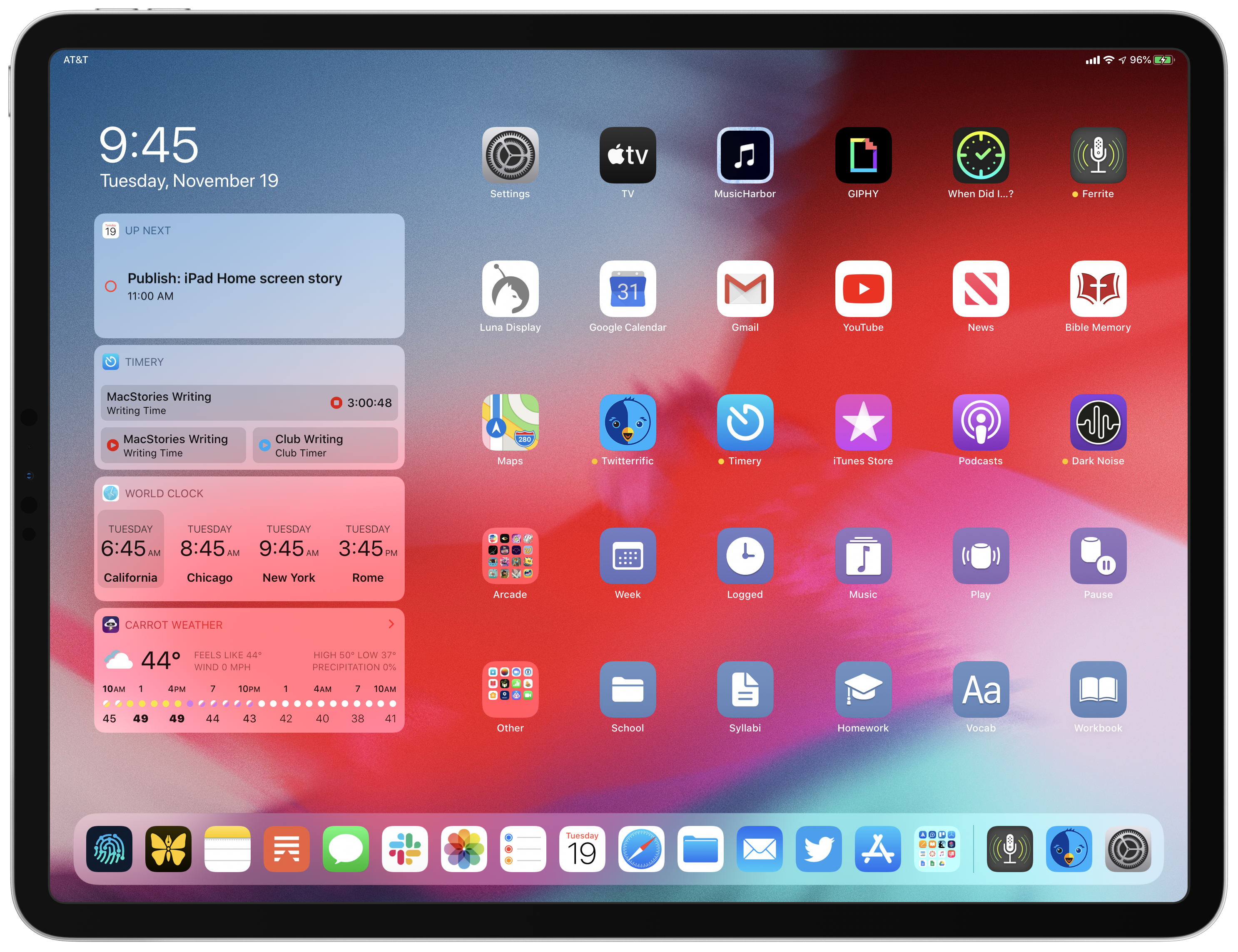
The main reason my new Home screen is noteworthy, however, isn’t its limited page count, but its variety of content types. There are apps, of course, and app folders, but there are also shortcuts, some of which perform actions and others of which open specific files or folders in the Files app.
Apps
- TV: Despite its flaws, which I outlined last week in a column for Club MacStories, I still find the TV app the best single-stop hub for my TV needs.
- MusicHarbor: This app does an excellent job identifying new single and album releases from artists you follow, picking up Apple Music’s slack in this area. For as long as Apple Music fails to keep me informed of new music I care about, MusicHarbor will remain on my Home screen.
- GIPHY: I want to make the world a better place. GIFs make the world a better place. So I keep GIPHY on my Home screen to remind me to send more GIFs.
- When Did I…?: One of my favorite new apps of recent memory, When Did I…? serves a very specific purpose: keeping track of the last time I did certain things, such as change my contact lenses, wash the bed sheets, replace the fire alarm batteries, and visit the doctor.
- Ferrite Recording Studio: Earlier this year I explained in-depth why Ferrite is my podcast editing app of choice. Every episode of Adapt was edited in Ferrite.
- Luna Display: I don’t use a Mac very often, but the one consistent task I use it for is podcast recording. Since the only Mac I own – a Mac mini – is used so sparingly, I keep it headless and access it exclusively from my iPad via Luna Display.
Google Calendar and Gmail are here not because I want them here, but because they’re requirements for work. I could access them through Safari, but with Gmail in particular the web app doesn’t adapt well in Split View configurations, so I just stick with the native app (even though it somehow doesn’t support Split View itself).
YouTube, News, and Bible Memory are all fairly self-explanatory. Maps is on my Home screen not because I use it for navigation, but because I’m using my iPad all day long, so any time I want to look up a location, or plot out a route, I do that on my iPad.
- Twitterrific: This may seem like an interesting choice since I already mentioned the first-party Twitter client in my dock. The reason I use two Twitter apps is that I don’t like keeping multiple accounts in a single app; I use Twitter’s client for my personal account, and Twitterrific for the Adapt account. It’s especially handy because thanks to multiwindow, I keep two Twitterrific windows side-by-side in a Split View, such that whenever I tap the app’s icon I get Adapt’s mentions on one side of the screen and a saved search for #AskAdapt on the other.
- Timery: As I already mentioned in covering my widgets, I use Timery for all Toggl time tracking. I’ll likely remove it from my grid at some point since I can launch the app from the widget, but for now it’s staying put.
- iTunes Store: As the video streaming wars start to rage, I check the iTunes Store a couple times per week to see if there are good deals on movies or TV shows I’m interested in. I’ve found that buying discounted content from iTunes is a good way to prevent the need for subscribing to more than a few streaming services at once.
- Podcasts: Up until recently, I did all my podcast listening via my iPhone, but two things changed that: first, in iOS 13.2, the HomePod’s new handoff feature unfortunately brought a regression in how streaming from an iPhone to HomePod worked; second, playing podcasts from my iPad works great when paired with some of the Home screen shortcuts I’ve created, which I’ll detail shortly.
- Dark Noise: If you need an ambient noise app, this is the one to get.
Folders
I don’t play a lot a games on my iPad, but my Arcade folder exists because there are a lot of games I want to play on my iPad, but haven’t made the time for yet. My latest Arcade Highlights story covered one title I’ve recently enjoyed, Sayonara Wild Hearts, but most other titles in this folder are still waiting to be played.
My Other folder contains every other app contained on my iPad. Most of these are apps that I use, but only rarely, so I typically launch them using Search. The first page of the folder contains apps I use a little more regularly than the rest, but still not too often. However, the folder also has a lot of apps I’m not actively using, but instead keep installed so I can stay apprised of any updates they receive. For example, despite Reminders being my current task manager of choice, I keep Things 3 and Todoist installed because I may want to re-try those apps when they add new features; also, for the sake of covering noteworthy updates on MacStories, it’s easier to just keep extra apps installed on my device rather than deleting them and re-downloading later.
Shortcuts
My final two Home screen rows both contain shortcuts. Before getting into the specifics of these shortcuts, however, it’s worth noting for long-time Shortcuts users that this past year Apple substantially improved the way Home screen shortcuts work. Formerly, launching a shortcut from the Home screen would first open Safari, because behind the scenes Shortcuts was employing web clips. If you, like me, try to keep your Safari tabs to a minimum, this made Home screen shortcuts extremely unappealing, because every time you ran a shortcut you’d be left with a new Safari tab, not to mention the annoying extra step of having to make a pit stop in Safari before arriving in Shortcuts. All of this has been fixed today: Home screen shortcuts now avoid Safari altogether, launching directly in the Shortcuts app as they always should have.
You’ll notice that while a couple of my Home screen shortcut glyphs can be found in the Shortcuts app, most of them cannot. Shortcuts includes a moderate-sized collection of glyph options, but it could stand to double or triple that assortment in the future to better suit common Home screen use cases. In the absence of appropriate options inside Shortcuts itself, nearly all of the glyphs I’m using come from the MacStories Shortcuts Icons, enabling my Home screen icons to more accurately portray the shortcuts they represent.
Action Shortcuts
I’ll start with my fourth row, containing five shortcuts, two of which relate to my work schedule and the other three to audio playback.
The Week icon originally triggered a shortcut that Federico created for Club MacStories members called Agenda Preview. As described near the end of his Toolbox Pro review, Agenda Preview gathers information about your tasks and calendar events over the next week and presents it all in a well-organized view, offering a quick, comprehensive look at your whole week. It’s a great shortcut, but just days ago I actually changed this icon to perform a different, yet related function.
As part of fulfilling a challenge for episode 13 of Adapt, I recently discovered a calendar app called Kalends which offers a single-screen view that, like Agenda Preview, combines events and reminders. What I really like about Kalends’ view is that it puts a full seven days on-screen at once, with no scrolling required. So now, my Week icon simply runs a shortcut that launches Kalends, enabling me with a single tap to instantly see my whole week ahead with no further interaction required. Normally, I’m not in the practice of adding Home screen shortcuts that simply launch a specific app, but in Kalends’ case I’m not a fan of its app icon, and I like thinking of it less as an app and more as a single-screen view of my week, so running it as a shortcut works well.
The second icon, Logged, runs a shortcut that’s almost as simple as my Week icon: it launches the Toggl app directly into the Reports tab so I can see how much time I’ve logged for work during the current calendar week. I have to do this in the official Toggl client because my preferred app, Timery, doesn’t yet offer reports functionality. I have a goal of hitting a certain number of logged hours each week, so I’ve found it helpful to keep a dedicated Home screen icon that immediately informs me of where I stand at any given point in the week.
The next three icons are all audio-related. It’s no coincidence that they sit directly underneath iTunes Store, Podcasts, and Dark Noise, which are all similarly audio-focused.
Music kicks off an advanced shortcut Federico has been working on for some time now, which he plans to share soon, but for today you’ll just have to trust me when I say it’s pretty fantastic.
The Play and Pause icons, as you can tell from their glyphs, have to do with my HomePod. Whenever I’m home, all of my audio playback goes through a HomePod, and these two shortcuts make that more convenient.
The Play shortcut contains two actions: Set Playback Destination and Play/Pause. The former sets the playback destination of my iPad to the HomePod, and the latter simply resumes the latest thing that was played on my iPad. Even though the HomePod is optimized for voice input, I almost never speak to Siri to initiate audio. I prefer manually selecting podcasts and music on my iPad or iPhone, then using AirPlay to stream that audio to the HomePod. Mainly this is so I can adjust volume and other playback controls from my device, rather than using additional voice commands for those things.
The Pause icon is even more simple than the Play one, containing a single Play/Pause action that either plays or pauses whatever my iPad’s currently playing. Typically, the Play shortcut is what I use when I’m first starting to listen to something, and thus need to connect to my HomePod first, while the Pause shortcut is for quickly pausing and resuming that stream throughout the day as needed. Avoiding opening Control Center and fiddling with playback and AirPlay settings from there has been very nice.
File and Folder Shortcuts
The five icons in my bottom row all have something in common: they relate to my university coursework. They also represent the fruit of Federico’s recent experimentation with Shortcuts and Scriptable to enable directly opening files and folders from Apple’s Files app.
This is something I’ve hoped would be possible for a long time, yet despite all the other Mac-inspired concepts the iPad has borrowed, storing files and folders on the desktop/Home screen has never been a built-in feature. Needless to say, I was thrilled that Federico came up with a solution.
Using Federico’s FS Bookmarks shortcut, I created two shortcuts that launch folders in iCloud Drive, and two that launch specific files; the fifth shortcut in my final row launches a specific note in Apple Notes.
The School and Syllabi icons are the two folder-launching shortcuts, offering quick, convenient access to iCloud Drive folders I regularly access inside the Files app. Homework is the Notes launcher I mentioned, opening a note where I keep a running list of all important upcoming assignments. And Vocab and Workbook each launch different PDFs, also stored in iCloud Drive, that relate to my studies. I’m taking a foreign language class, so the Vocab icon gets launched all the time to help me practice the vocabulary repetition I need.
A Tangent on Shortcut Colors
Aesthetics on my Home screen are important to me, so it probably shouldn’t surprise anyone that before committing to the colors of my current Home screen shortcuts, I did some testing.
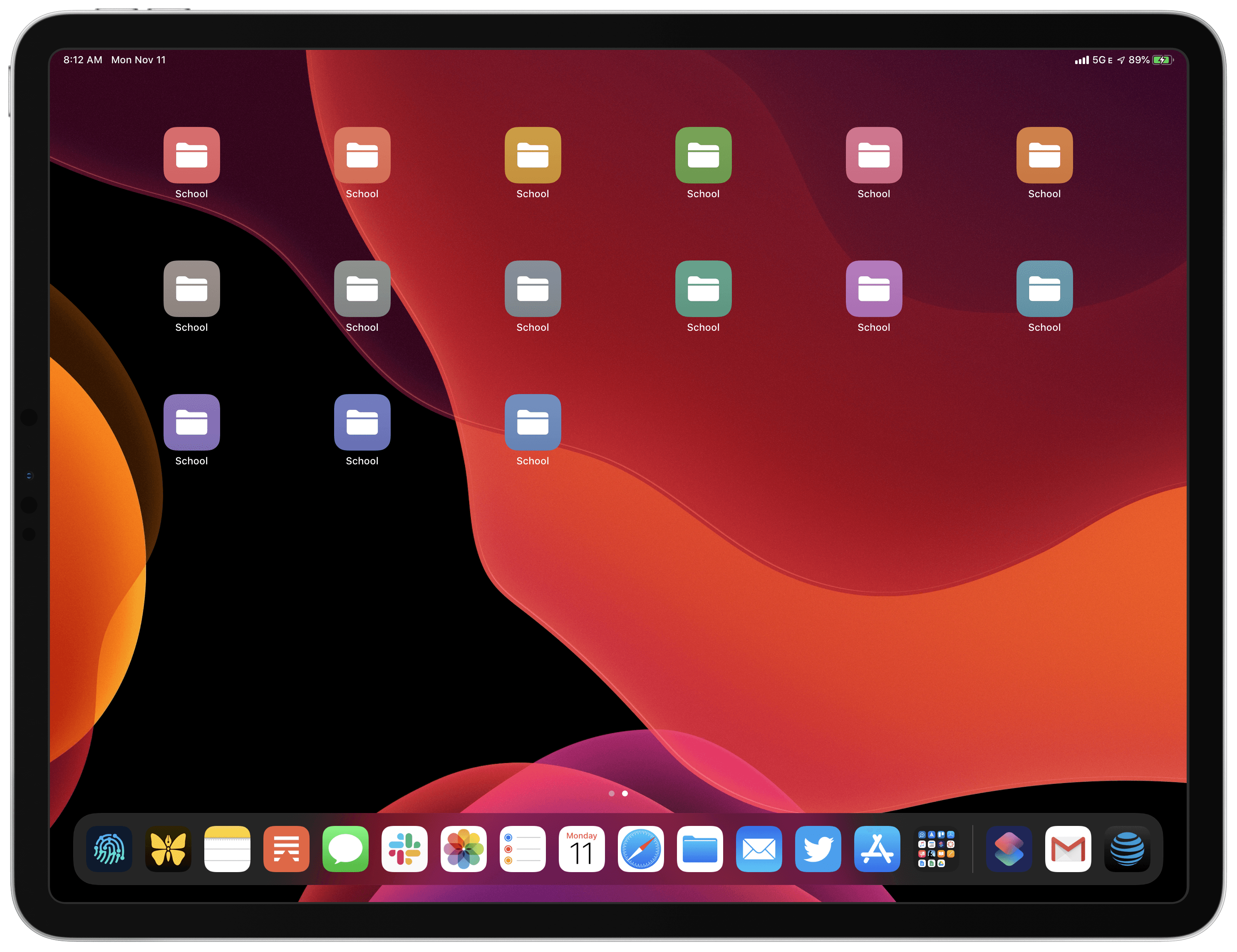
Yes, I made a Home screen icon for every possible color that Shortcuts lets you use, then slowly filtered down to the ones I thought looked best in both light and dark modes with my current iPad wallpaper and with the other app icons in my grid. Part of me wishes Shortcuts offered a lot more flexibility in color choice, but it may be for my own good that a limited number of options are present.
I settled on various shades of blue and purple as my favorite choices for Home screen shortcuts, and decided to use my three favorite shades to differentiate between different types of shortcuts. My bottom row shortcuts, which all relate to school, are the same blue color. The row above that, however, containing my schedule and audio-geared shortcuts, features two distinct colors. The difference is subtle, but my two schedule icons lie more on the blue end of the spectrum, while the audio icons are a bit more purple. I purposely wanted them to look very similar, but with a slight hint of distinction. And both, of course, needed to blend well with the blue icons below them. It was also no coincidence that the row of apps immediately above my blue/purple row have – you guessed it – icons dominated by blue and purple.
Gone are the days when an iPad’s Home screen was just a larger version of the iPhone’s. You can now pin widgets, load an omnipresent dock with your most-used apps, and use the extra icon slots to save shortcuts that range from opening files and folders to controlling audio playback to performing more complex actions.
The beautiful thing about all of these changes is that users can completely ignore them if they want to. If you want to use your iPad effectively as a large iPhone, you can still do that, with the classic grid of apps and no further complications. For users who want more, however, iPadOS has a lot of depth to offer.
The iPad’s Home screen can now be a true workspace, flexible and diverse enough to make it whatever you need. It’s fitting that this is the year device rotation finally stopped messing up your icon positioning. If you use the new, expanded icon grid, your arrangement of icons stays in place whether in portrait or landscape orientation. No more having your workspace shuffle around every time you switch modes.
This small, but important tweak is emblematic of the wider changes iPadOS brought to the Home screen: they may seem like minor iterations on paper, but in everyday experience, they solve so many of the pain points and limitations of iPad power users.
After Apple supercharged the iPad’s dock in iOS 11, the Home screen felt superfluous. Many users put all of their apps in the dock and left their Home screens empty, and I understand why: the Home screen simply didn’t have much to offer. With the dawn of iPadOS this year, that’s entirely changed. The dock remains the most important place for apps, but now the rest of the Home screen can bring value too. With pinned widgets plus 30 icon slots to fill with apps, files, folders, and other shortcuts, the Home screen has more potential than ever before. It takes some thought and effort to set up, and involves more workarounds than it should, but iPad users can now build more powerful Home screens than ever before.
iPad computing has never been better than this.