
Interfaces with completely flat visual design do not use any realistic or 3-D visual effects. As a consequence, they do away with the heavy-handed visual cues that have been traditionally used to communicate clickability to users.
The popularity of ultraflat interfaces has declined since its heyday of 2013, and more websites are adopting more moderate, flat 2.0 designs — in which interfaces make use of subtle effects to create the impression of a slightly layered 3-D space. Despite this return to moderation, we’re starting to see the long-term impact of the widespread usage of weak clickability cues encouraged by the popularity of flat design.
Clickability Signifiers: Before and After Flat Design
To know where they can click on a website, users need signifiers: perceptible clues that help them understand how to use interfaces. Blue underlined text is an example of a traditional signifier of a clickable link that even the least experienced web users understand.
In the old days of rampant skeuomorphism and realism in web design, users were generally able to rely on obvious — but often ugly — signifiers of clickability (such as glossy, raised effects on buttons, or inset shadows that made input fields appear empty). Even though these signifiers varied from site to site, users could usually rely upon two assumptions:
- Elements with strong signifiers were probably clickable.
- Elements without strong signifiers were probably not clickable.
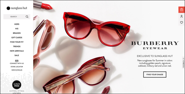
Flat design increased the popularity of designing clickable elements with absent or weak signifiers. Linked text styled as static text is an example of an absent signifier. A ghost button (text with a thin border and no background color) is an example of a weak signifier — a subtler version of a traditional clickability signifier.
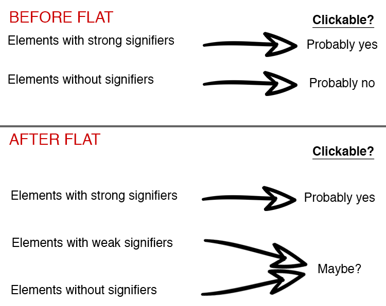
The introduction of flat design has led to widespread problems of absent and weak signifiers, so users now have to contend with 3 possibilities:
- Elements with strong signifiers are probably clickable.
- Elements with weak signifiers are sometimes clickable. (The visual effect might be intended as a signifier, or it might serve a purely aesthetic purpose with no relevance to the interaction design.)
- Elements without strong signifiers are sometimes clickable. (The designer may have left out the signifier on purpose, or the element may not be clickable.)
The Contaminating Effect of Weak and Absent Signifiers
This new situation is slowly influencing the way users interact with clickable elements on the web, and we see evidence of changing behavior patterns during usability testing.
Users are forced to explore pages to determine what’s clickable. They frequently pause in their activities to hover the mouse over elements hoping for dynamic clickability signifiers, or click experimentally to discover potential links.
This behavior is analogous to the behavior of laboratory rats in operant-conditioning experiments: if a rat gets a food pellet at random intervals after performing a specific action, the rat will keep doing that action in the hope of getting fed again. Similarly, users have discovered that clicking elements that don’t have strong signifiers sometimes works. Like the lab rats, users will stick to random clicking as long as they get rewarded from time to time.
Even though users are mostly able to find their way through interfaces with this exploratory behavior, they’re still being forced to do extra work and are being distracted from their primary goals without gaining any tangible benefit.
In an eyetracking experiment comparing strong-signifier interfaces to weak-signifier interfaces, we found that participants had to spend more time looking at the weak-signifier pages to complete short findability tasks.
Users are more reliant on feedback after they click (or tap) on an element. When users don’t feel confident that something is clickable, they need immediate reassurance after clicking. If there is any delay between a click and a change in the system, users begin to wonder if the element was actually clickable and may give up in favor of clicking on another potential link. (According to the guidelines for website-response time, the perception of immediate feedback for a click means within 0.1 seconds.) Common examples of feedback include:
- color changes
- adding a button-press visual change
- progress indicators
- status updates (such as a cart total changing in response to a user action, or an alert confirming the action)

Users are more dependent on context clues to determine clickability. In an environment where clickability signifiers are absent, users look for other clues to help them identify possible interactive elements. They’re looking for clues that require an inference in order to draw a conclusion, like a fingerprint left at the scene of a crime. Processing context clues forces users to spend more time and effort to understand the available options.
These contextual clickability clues can include:
- The language used in text elements (e.g., actionable phrases like Buy Now or Find)
- The placement of elements (e.g., a horizontal row of words or phrases at the top of a page usually acts a global navigation)
- Surrounding elements (e.g., a word that might not suggest clickability on its own, but is placed near similarly styled words that are often linked, like Contact Us and Locations)
You may ask: isn’t it a good thing if users are forced to pay more attention to language and placement of design elements on the screen? In our course on the foundations of HCI we teach that deep processing is better for memory than shallow processing (in other words, processing the meaning and context of text is better than processing only superficial aspects of the design, such as text color). However, deep processing incurs a higher cognitive load: users now have to carry in their working memory all that extra information that they don’t need. It also increases user frustration and the perception of working too hard at a task, thus making people more likely to abandon it. When users divert their attention to the detective work of decoding circumstantial clickability clues, they have less bandwidth to learn about your organization and products.
Young Adult Users and Clickability Signifiers
Some designers argue that it’s okay if older users don’t find flat design intuitive, because flat interfaces are targeted at younger users, who get it. When comparing similar sessions with young and old adults who took part in the research for our course on Designing for Young Adult Users, we’ve found that young adult users (age 18–30) actually do seem to be better than older adults at detecting clickable elements, even when they have absent or weak signifiers — specifically, young adults identify possible targets more quickly.
There are several possible reasons for this phenomenon, and any combination of them might be true.
- Young adults may be more attuned to subtle placement clues.
- Young adults may have been more frequently exposed to flat interfaces or to other more exploratory interfaces (such as games).
- Young adults may be better at recognizing elements that tend to be clickable and at quickly learning new design patterns.
Despite their ability to navigate through clickable elements with absent or weak signifiers, young adult users don’t enjoy click uncertainty any more than other user groups.
Young adult users seem to rely heavily on hovering as a strategy to determine clickability. When asked how she knew what was clickable on web pages, one user said, “By scrolling over it … then you know. Otherwise I actually don’t know. Some stuff you assume. But it’s nice when links are bolded and you can tell. […] It’s hard when you think something's a link and it's not. And you have to figure out how to get it another way.”
Another young adult user responded to the same question with, “I don’t [know what’s a link]. I just start clicking and praying that it works.”
Creating Click Confidence in a World of Click Uncertainty
Here’s the bad news: Jakob’s Law of the Internet User Experience states that “users spend most of their time on other websites than your site.” Learned behavior and expectations transfer from site to site, so even if your site doesn’t use a minimalist or flat aesthetic, your users are likely influenced by the designs they encountered elsewhere and may try to click or hover needlessly to identify potential targets. Consequently, the suboptimal behaviors that your users are learning as an adaptation to absent and weak signifiers on other sites are probably here to stay.
Here’s the good news: these new behavior patterns aren’t necessarily the end of the world, they just mean you have to consider them in your designs. And here’s more good news: you don’t have to go back to the garish realism effects of yesteryear to communicate clickability. You can give your users a beautiful, simple interface and help them feel empowered and confident about the actions available to them.
- We recommend always using some amount of visual signifier on clickable elements — whether you want to use conventional, strong signifiers such as blue links or more subtle, weak signifiers (such as ghost buttons). Regardless of the design aesthetic you choose, follow our guidelines for signaling what’s clickable. Clearly communicating clickability is good for making users feel in control, but it can also help encourage them to take actions that they might otherwise not realize are available.
- For primary elements and features, don’t use hover as the only way to reveal a signifier. Using hover signifiers might be fine for secondary content when they fit naturally in a user’s workflow. For example, on ecommerce sites, a subtle magnifying-glass icon that appears in the corner of a product image when users hover over it will reinforce their expectation that clicking on the image will enlarge it.
- If you choose to leave out visual signifiers for aesthetic appeal, make sure you provide strong feedback. Immediate, noticeable feedback is always necessary for usability, but it becomes even more critical when users aren’t confident that they know what’s clickable. When users click on something with uncertainty, they immediately start looking for reassurance that they made the right choice.
- As always, your decisions should be influenced by the characteristics of your users. If you’re designing for younger users, they may be better able to figure things out without strong clickability signifiers — just be prepared to accept the consequences of making your users feel less in control of the interface. And, as always, the best way to find out how your users will actually handle your interface is through user research and analytics.
- Watch out for the contextual clues in your interface. It’s not enough anymore to simply not underline a heading to communicate that it isn’t linked. Users are now more likely to click elements with no signifiers, because you can bet they’ve run into a situation in the past where that same element didn’t have any signifiers but was clickable anyway.
Conclusion
Please don’t think that because your younger users can adapt to poorly designed interfaces you’ve got a blank check to design careless, signifier-free interfaces. When users aren’t sure where they can click, they lose that sense of empowerment that is so critical to a positive experience. They have to slow down to determine where they can go next, which is an unnecessary addition to their cognitive load.
The motivation behind minimalist and flat design was a desire to get the ugly distractions out of the interface, so that the focus is on the content and user tasks. It’s ironic, then, that the misuse of these design styles slows users down by forcing them to think harder about what options are available to them.
If your UI uses a flat design, make sure you follow the best practices to avoid its pitfalls.
More on the special online behaviors of the Millennial generation and these users’ attitudes toward websites in our online seminar Millennials Online: Facts and Fictions.
More on signifiers in the full-day course User Interface Principles Every Designer Must Know.

