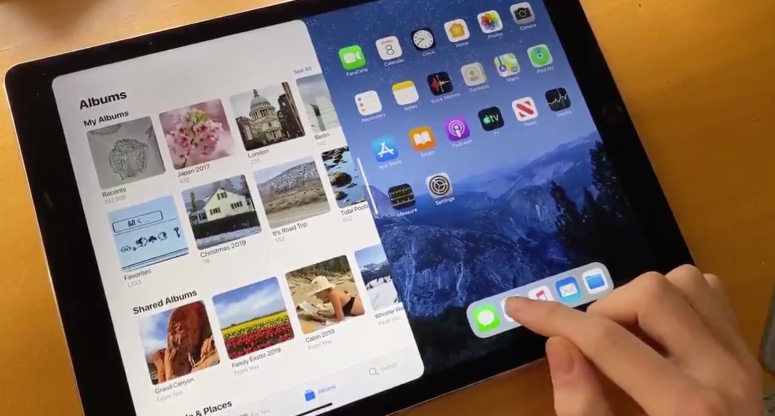
Check out this iPad multitasking concept right now. It’s so good, one wonders why Apple didn’t already do it this way:
Home screen FTW
iPadOS multitasking concept pic.twitter.com/wBmCrRBqWe
— tommy (@Rutherling) February 24, 2020
This amazing mockup/concept was executed by design student Tommy Rutherling using the Principle app to create the interactive animations. The gist of this split-screen iOS redesign is that an app can occupy half the screen, while the other half shows the regular Home screen. Imagine two iPads side by side, each in portrait orientation, and you have the idea.
This simple reframing of iPad multitasking makes a huge difference to both usability and to discoverability. You only need one finger to pull in a new, blank Home screen from one side, to resize the on-screen apps, or to dismiss the panels.
This iPad multitasking concept needs work, but is still awesome
I showed Rutherling’s iPad multitasking concept video to other Cult of Mac writers in our Slack chat, and the general opinion is that it looks awesome. We all want it now. But it needs work. As is, Rutherling’s concept treads on the toes of too many other iOS gestures. A one-finger swipe up currently enters the multitasking overview, or shows the Dock. A one-finger swipe from the left currently means “back” in Safari, and many other apps.
But that’s hardly the point. Those are the kind of details that Apple can sweat over. And one could argue that the current gestures on iPadOS are already overloaded, and should be slimmed down. Maybe we don’t need a pop-up dock. It could stay on the Home screen, like it always did before iOS 13. Apple could ditch the iPad multitasking grid, too. I wouldn’t miss it.
Why hasn’t Apple already done this?
One does wonder, though, why Apple hasn’t already pursued this type of functionality for iPad multitasking. After all, the idea of splitting the screen into two halves naturally leads to one half being an app, and the other half being the Home screen (aka the iPad’s desktop).
Perhaps it’s because this setup is too much like the Mac concept of a desktop with windows. The thing is, that’s an excellent concept. Why not inject a bit more of the Mac into the iPad? The bits that make sense, anyway.
So, thanks Tommy. Thanks for nothing. Because now I have to think about your amazing concept every time I use the convoluted mess that is multitasking on the current iPad.


